Everyday Ingredients Are Finally Getting Serious Packaging
Milly reframed pepper as a kitchen workhorse. Eme built skincare around simplicity. Both prove that commodities don't need personality injections — they need honest, confident design.
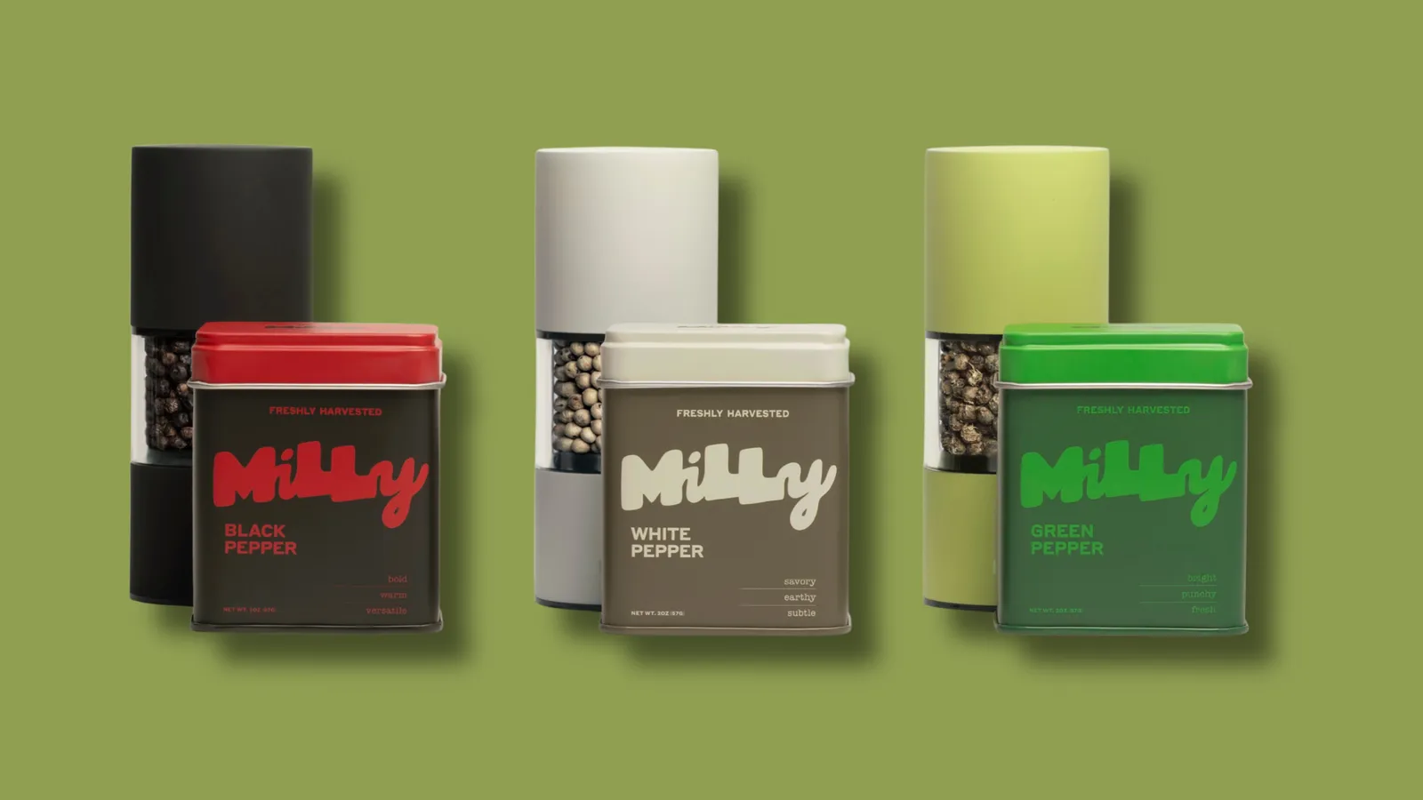
Pepper has been on every kitchen counter for centuries. It has never needed a rebrand. And yet Milly's positioning — pepper as the workhorse it's always been — is a smart brief because it resists the urge to make the ordinary exotic. The packaging doesn't claim pepper is a superfood or a culinary revelation. It just treats pepper seriously.
Eme Skincare did something similar. In a category full of ingredient lists and clinical promises, they centered the brand on simplicity and balance. Not a hero ingredient. Not a ten-step system. Just a considered, quiet confidence in what the product actually does.
Both of these are harder to execute than they look. The reflex in brand design is to add — more story, more benefit claims, more visual complexity — because plain feels like nothing. But plain, done well, is a position. It says the product doesn't need to perform. It just needs to work.
This is worth paying attention to because it runs against the loudness that dominates DTC packaging right now. Bright colors, bold claims, mascots — all of it is competing for the same attention. Milly and Eme are betting that restraint cuts through the noise more reliably than another loud challenger brand.
For founders in commodity or near-commodity categories, the question is whether your packaging is trying too hard to convince. Sometimes the most confident thing design can do is stop explaining.