Heritage Brands Redesign by Doubling Down, Not Reinventing
Miller High Life and Labatt both got refreshed recently — and both studios made the same call: don't chase new audiences by erasing what loyal ones already love. The icon is the brief.
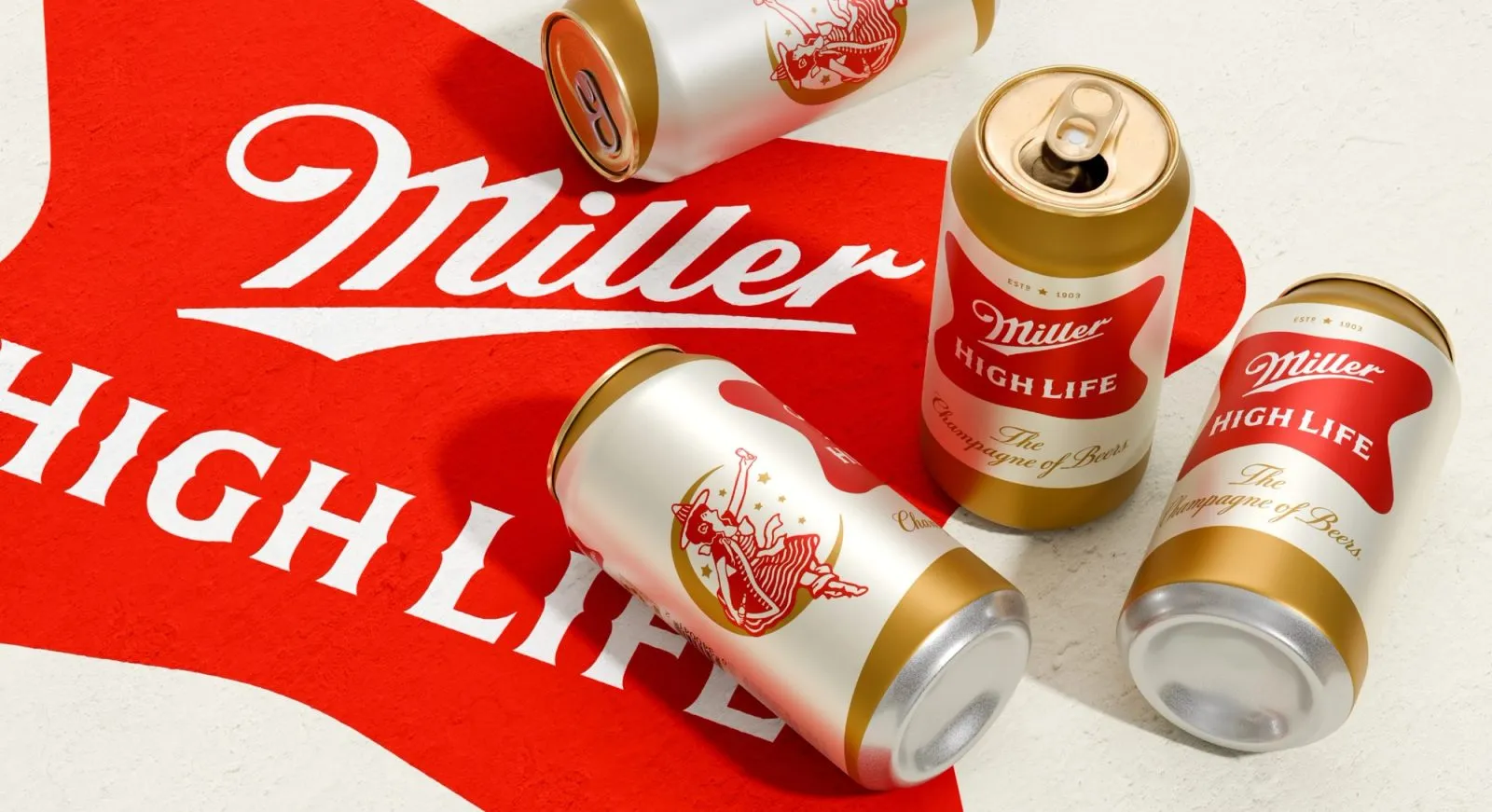
Soulsight's Miller High Life refresh and the Sister Mary-led Labatt redesign arrived around the same time, and the strategic logic behind both is almost identical. Rather than modernize by subtraction — stripping away heritage marks, softening colors, adding a sans-serif wordmark — both teams identified the single most recognizable asset and pushed it harder.
For High Life, that's the 'champagne of beers' positioning made visual. For Labatt, it's about translating a Canadian brand identity into a US market without flattening what made it Canadian in the first place. Born somewhere specific, redesigned to travel — that's a difficult brief. The temptation is always to sand down the edges.
What both refreshes signal is a growing skepticism toward blank-slate rebrands in the beer category especially. Craft beer spent a decade proving that maximal, idiosyncratic design could win. Legacy brands watched. Now the move isn't to copy craft's visual language — it's to find what's already irreplaceable in your own history and make it impossible to ignore.
This matters for any studio working on a heritage brand brief. The question isn't 'what do we update?' It's 'what would be genuinely painful to lose?' Start there. Everything else is negotiable.