Logo Archaeology Is Now a Consumer Content Category
Wallpaper* ran four "Anatomy of a logo" pieces in one editorial cycle — MoMA, Nike, IBM, Hollywood. Origin stories for visual marks have become a durable content format, and that tells us something real about how people relate to brands.
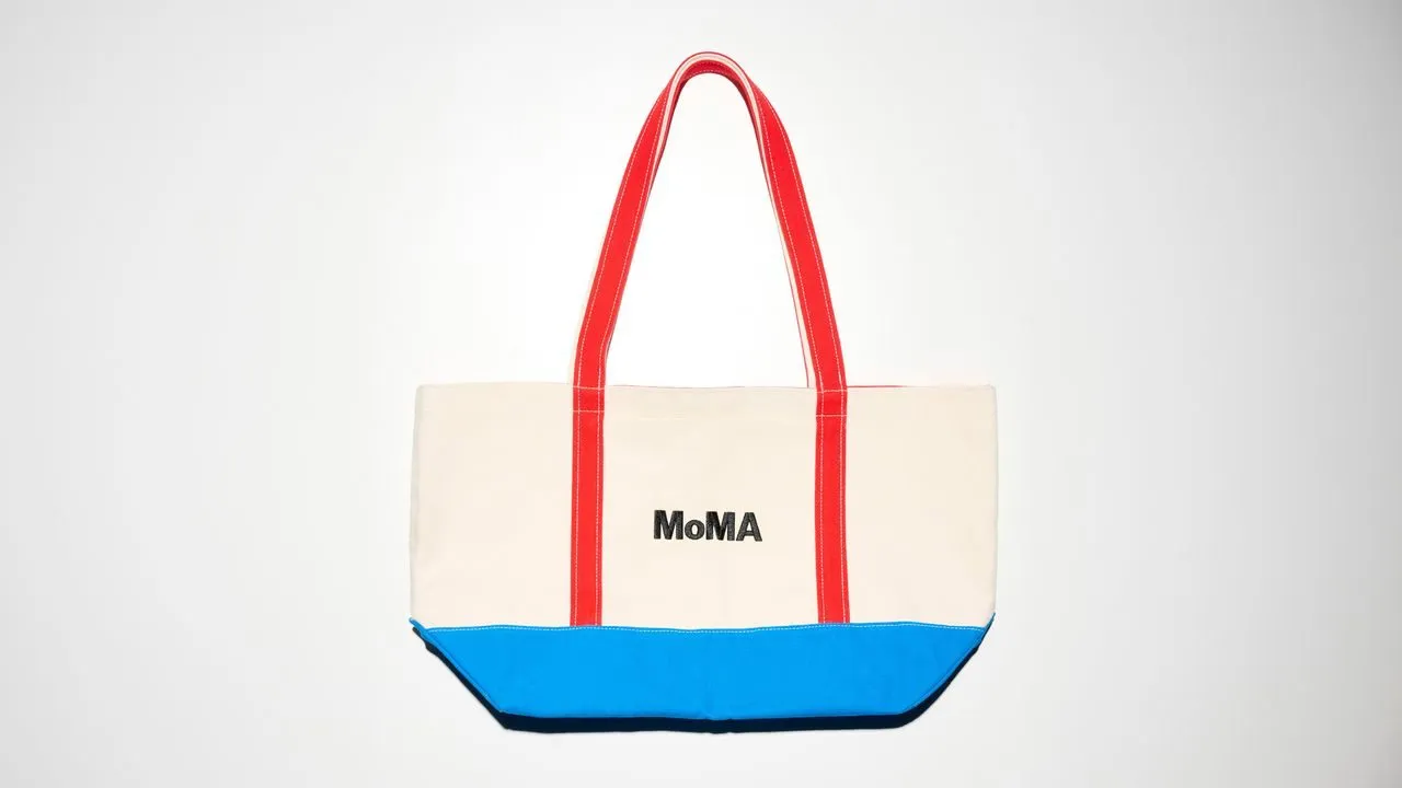
Four "Anatomy of a logo" features in a single editorial run: MoMA by Ivan Chermayeff, the Nike Swoosh, IBM by Paul Rand, the Hollywood sign. That's not a coincidence — that's a format that's working.
The consumer appetite for brand origin stories has quietly become substantial. Not brand history in the corporate-anniversary sense, but the specific, almost forensic interest in why a mark looks the way it does, who made the decision, what was rejected. Paul Rand's IBM. Carolyn Davidson's Swoosh for $35. These are stories with stakes, constraints, and named people — which is exactly why they hold attention.
What's driving this isn't nostalgia. It's a kind of design literacy that's been building for a decade, accelerated by the ease with which anyone can now make a logo — and therefore the ease with which people can see when one is bad. Audiences that use Canva and Figma and Midjourney are audiences that have opinions about type and mark-making. They want context for the things that shaped the visual world they grew up in.
For studios and brand builders, this is actionable. The process behind a mark — the brief, the constraints, the iteration — is content with genuine value, not just behind-the-scenes filler. The brands and designers willing to be specific about *why* a thing looks the way it does will own more of the conversation than those who let the work speak without context.