Packaging Is Borrowing From Subculture, Not Lifestyle
Coffee brands referencing cigarette pack aesthetics, whiskey that doubles as bug repellent, cocktail brands told to 'make it cool' — the best packaging work right now pulls from unexpected cultural codes, not category conventions.
Myaizg looked at its coffee brand and decided the right reference wasn't artisan roasting or Scandinavian minimalism. It reached for the visual language of a cigarette pack — a category defined by taboo, ritual, and obsessive loyalty. That's a sharp creative decision.
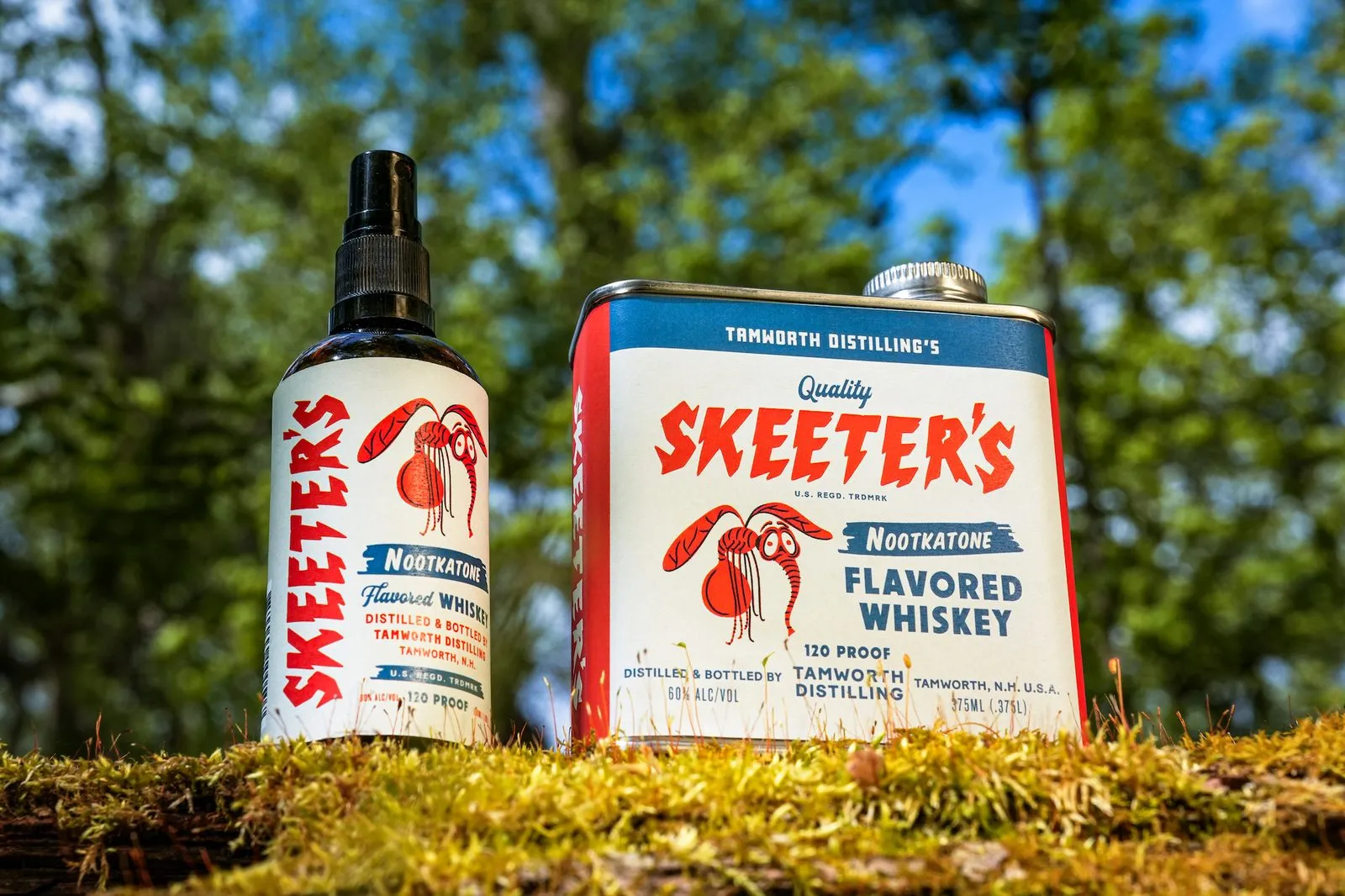
Skeeter's nootkatone whiskey is a different kind of move. The product is genuinely weird: a flavored whiskey that also repels mosquitoes. The packaging has to explain a functional claim that sits well outside what whiskey bottles normally say. That's not a style exercise — it's a communication problem that design had to solve.
Canary Cocktails got a brief from Young Jerks that was apparently just 'make it cool.' The resulting work shows what good packaging does when it's freed from category clichés: it finds a visual vocabulary that feels native to an attitude rather than native to a shelf.
The thread across all three is that the designers involved refused to audit competitor packaging and split the difference. They went elsewhere — to subculture, to function, to pure attitude — and came back with something that earns attention precisely because it doesn't look like the category.
Most packaging briefs start with a competitive audit. That's useful for avoiding mistakes. It's a poor starting point for making something memorable. The better question is: what *other* visual worlds does our customer already trust?