Dr.Pal's NewME -
NewME
Introduction
NewME is a doctor-led health platform focused on metabolic and gut health through structured, long-term care. As the brand evolved, it needed an identity that reflected its clinical expertise while creating a more modern and approachable experience.
We partnered with NewME to deliver a complete rebrand, including the logo, visual identity, colour system, typography, iconography, and UI redesign.
Our Design Approach
The rebrand was built around one core idea: connected care.
We moved away from conventional wellness aesthetics and created a system that balances clinical credibility with clarity, warmth, and simplicity. Every element was designed to communicate trust, structure, and long-term wellbeing.
Logo & Identity System (Old vs new logo to be showcased with variations)
We redesigned the NewME logo from the ground up, creating a modern identity built on balance, proportion, and consistency.
Colour System
A distinctive colour palette was developed to balance healthcare credibility with warmth and optimism.
The combination of grounded greens, vibrant accents, and a signature gradient helps create a brand that feels contemporary, approachable, and trustworthy.
Typography
We established a flexible typography system that creates clear hierarchy while maintaining a refined and approachable personality.
The type pairing supports consistency across brand communications, marketing materials, and digital interfaces.
Custom Iconography
A bespoke icon system was created to simplify complex health concepts into clear and intuitive visual elements.
Built with consistent geometry and stroke styles, the icons create a cohesive visual language across the entire ecosystem.
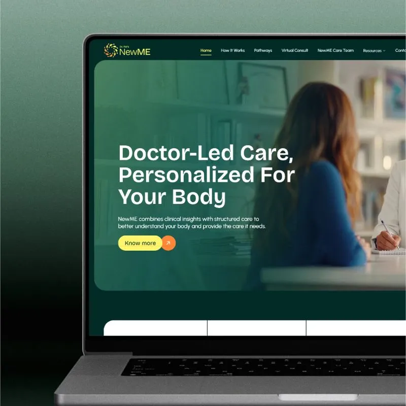
UI Rebranding
Beyond the identity, we completely reimagined the digital experience.
The UI system was redesigned to improve navigation, enhance clarity, and create a seamless healthcare journey. Every screen was aligned with the new brand language, resulting in a more intuitive, structured, and engaging user experience.
The Outcome
The result is a cohesive healthcare brand that feels modern, credible, and approachable.
From the logo and visual identity to custom icons and a fully reimagined digital experience, every touchpoint now reflects NewME's commitment to connected, doctor-led care and long-term wellbeing.
A brand designed not just to look better, but to create a stronger and more meaningful healthcare experience.

Working on something like this?
Tell us about the brand or business you're building. We reply within 24 hours.
Start a project