Amfries - Buidling an Amsterdam Original Fries
Amfries
Introduction
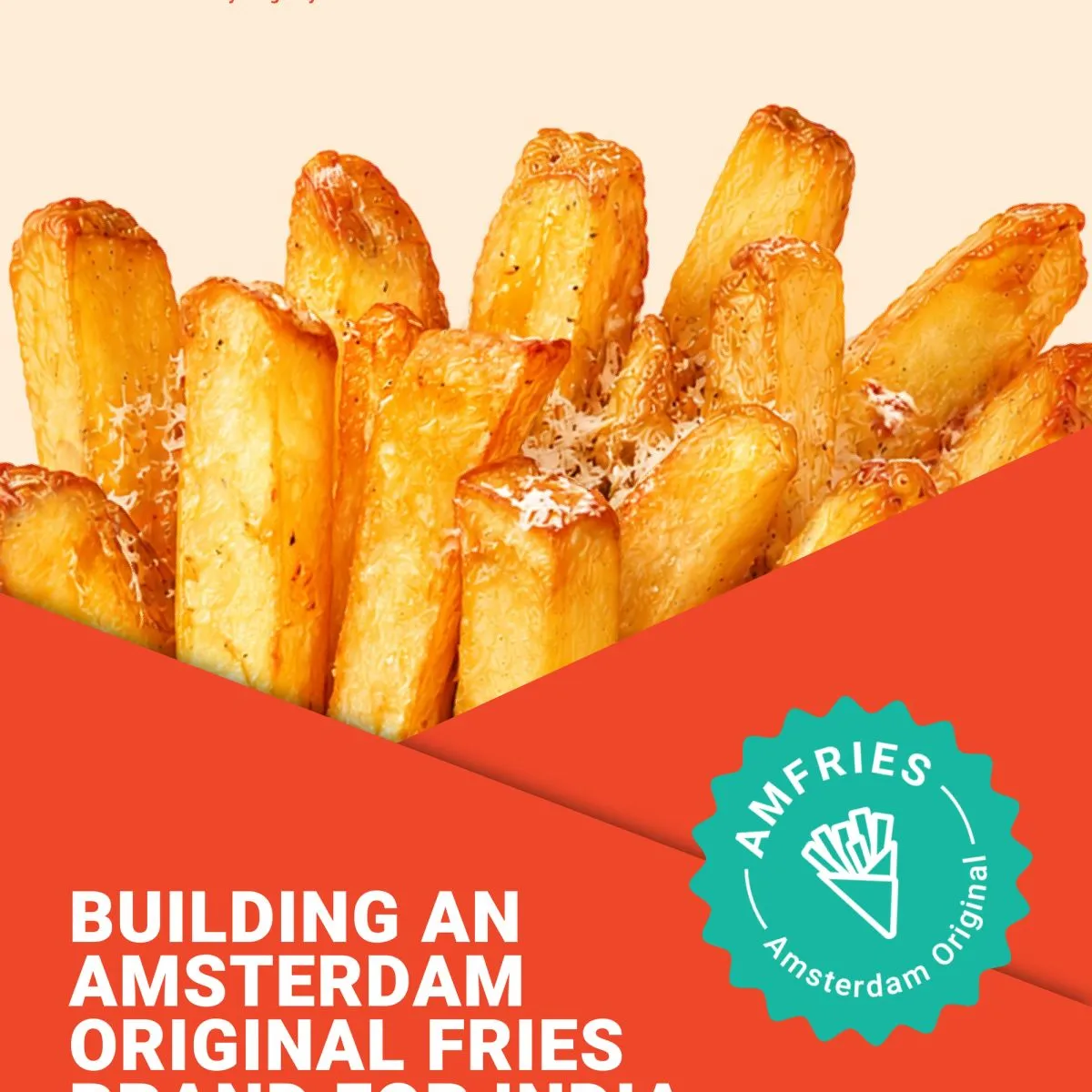
The Indian QSR landscape is crowded, fast-moving, and dominated by generic cues of convenience and value. Amfries was conceived to challenge that sameness by introducing an Amsterdam-original approach to fries, grounded in process, product integrity, and restraint rather than excess branding.
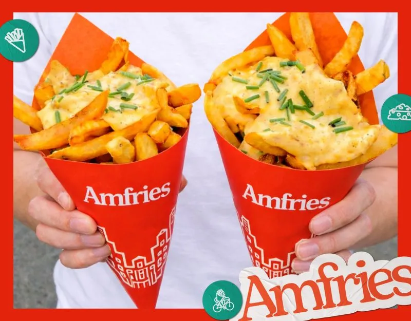
The brief was not to create another fast-food identity, but to build a focused fries brand where craft, consistency, and attitude are immediately legible. Hand-cut potatoes, double-frying techniques, and globally inspired sauces formed the foundation of the product. The brand needed to communicate indulgence without chaos, and premium intent without pretension.
We were engaged to build Amfries as a complete brand system from the ground up, ensuring that every visual and verbal decision reinforced a single point of view. Fries, done properly, and presented with confidence.
Brand Creation
Our scope covered the full construction of the brand, from naming and identity to tone of voice and application systems. Rather than rely on familiar fast-food tropes, we focused on building a brand with clarity and control, one that allows the product and its process to lead.
The identity balances European provenance with contemporary snacking culture, creating a brand that feels distinctive in the Indian QSR context while remaining accessible and scalable.
Logo Design
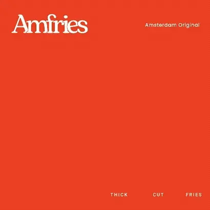
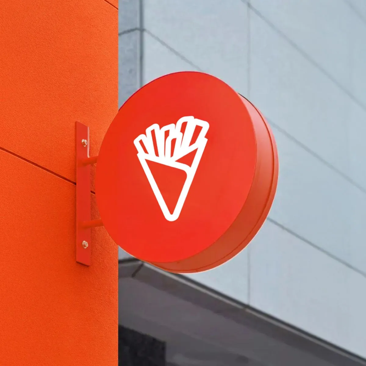
The Amfries logo draws from classic European signage, referencing Amsterdam’s street culture and food heritage through structure rather than nostalgia. A serif-led form communicates craft and credibility, while softened proportions keep the mark approachable and modern.
The logo was designed for high-frequency use across packaging, menus, and physical environments, ensuring clarity, recognition, and consistency at every touchpoint.
Colour Palette
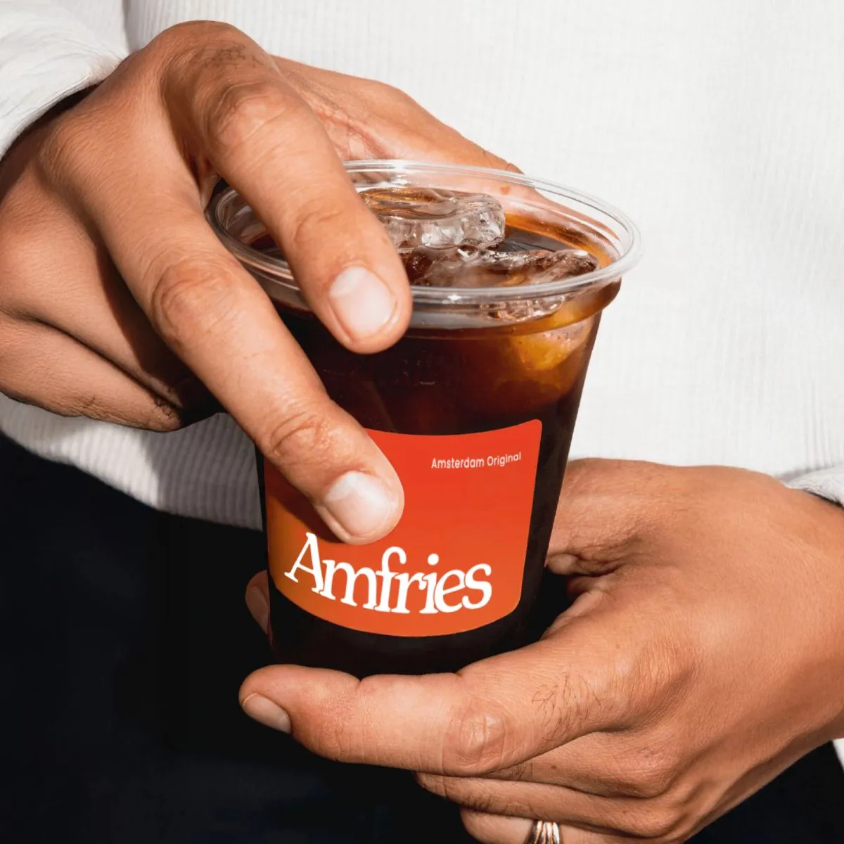
The colour system is built around appetite, warmth, and immediacy. A bold burnt orange anchors the brand, signalling indulgence and energy, supported by neutral beige and strong black-and-white foundations.
Colours are applied with restraint and intent. The system avoids visual noise, allowing Amfries to remain recognisable and confident across dense QSR environments.
Typography
Typography plays a central role in establishing the brand’s tone. A slab-serif primary typeface brings weight and personality, reinforcing the brand’s confidence and product-led approach. A clean secondary sans-serif supports clarity and structure across menus and communication.
Together, the typographic system allows Amfries to be expressive without losing discipline, ensuring consistency across both digital and physical formats.
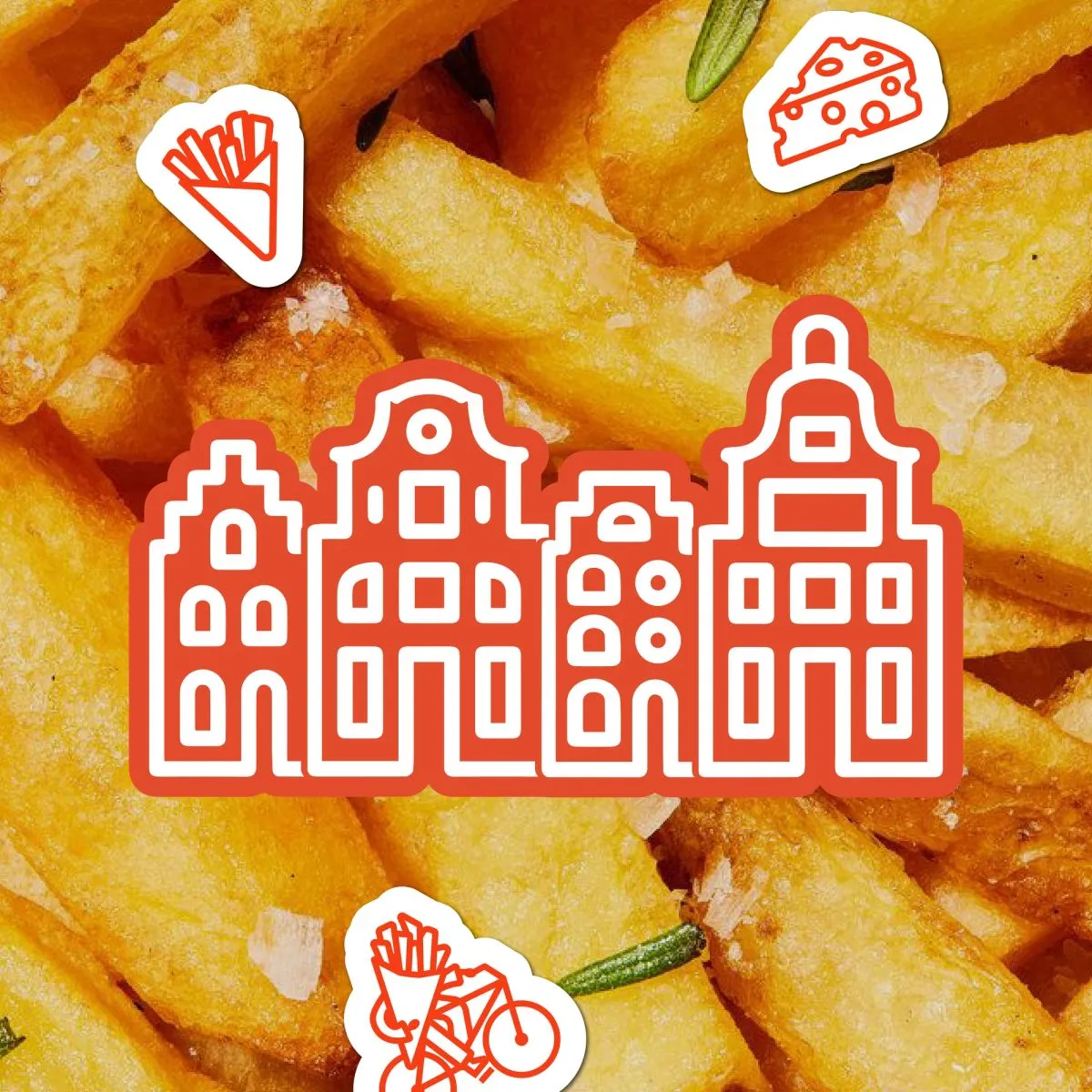
Brand Elements and Graphic Language
Supporting graphic elements are informed by Amsterdam’s street culture and the rituals of fry consumption, translated into a simplified, contemporary visual language. Icons, patterns, and layout systems are designed to add rhythm and recognisable character without overwhelming the core identity.
The result is a system that is flexible, modern, and easily scalable across new formats and locations.
Applications
The brand was rolled out across key consumer-facing touchpoints, including:
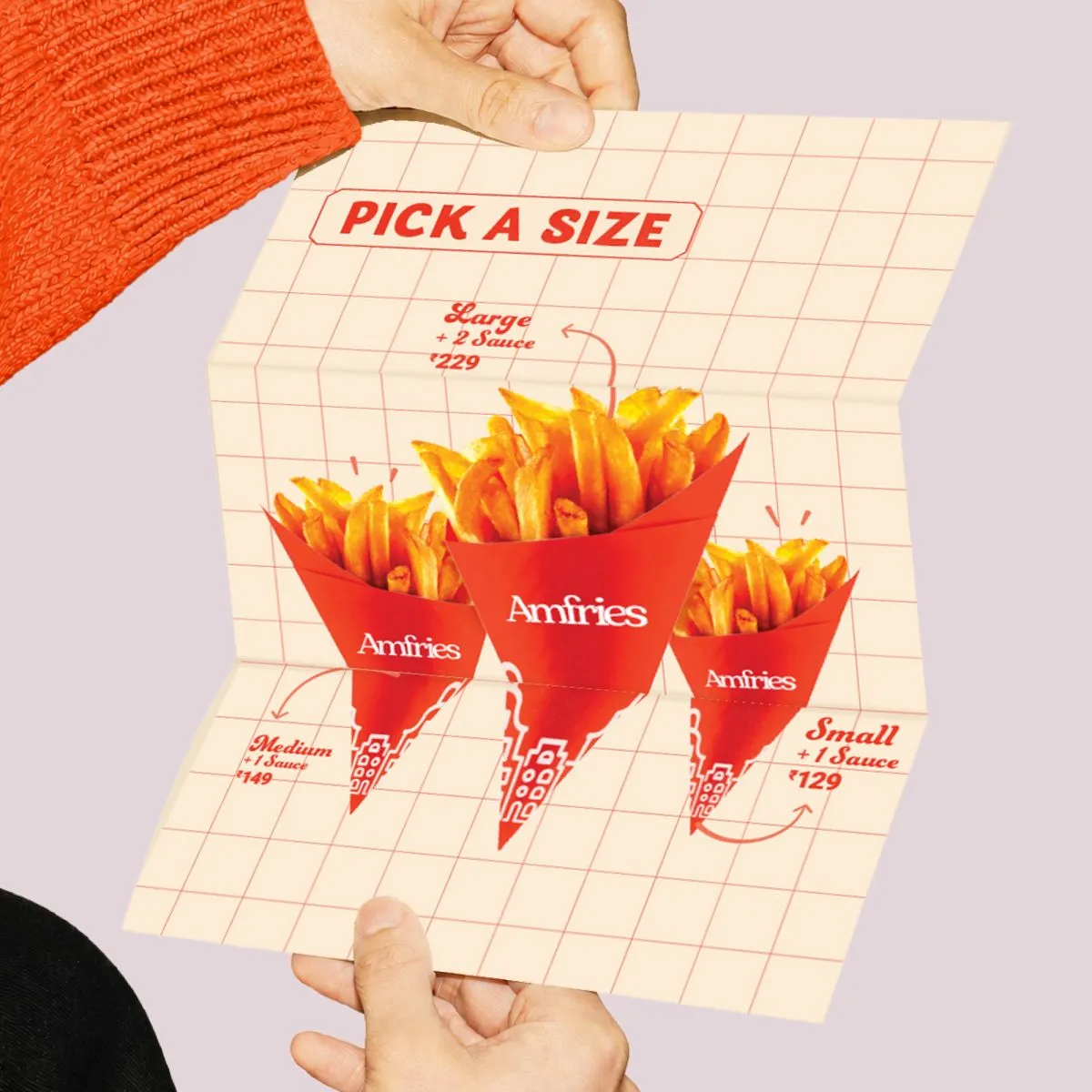
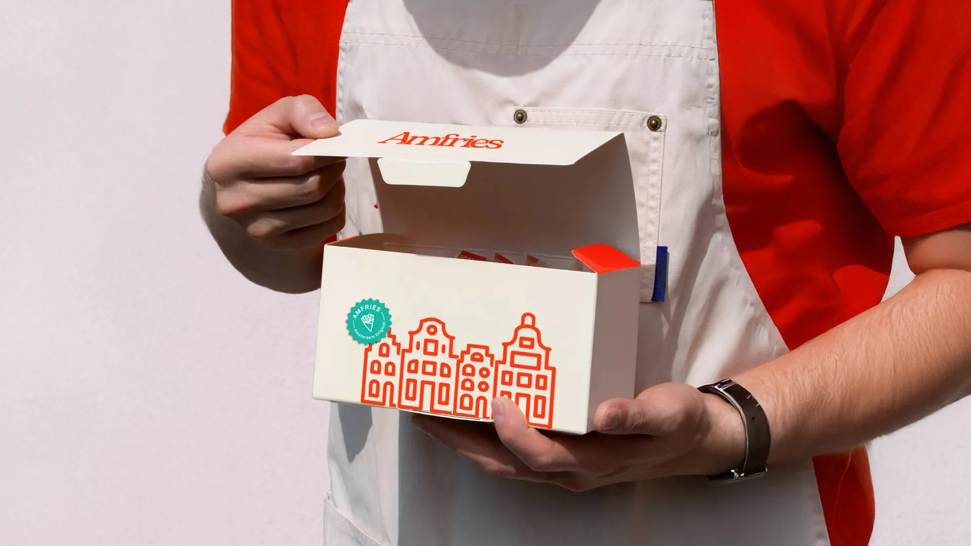
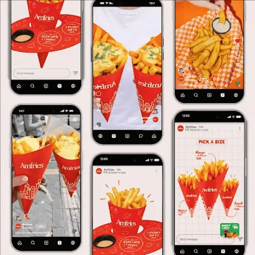
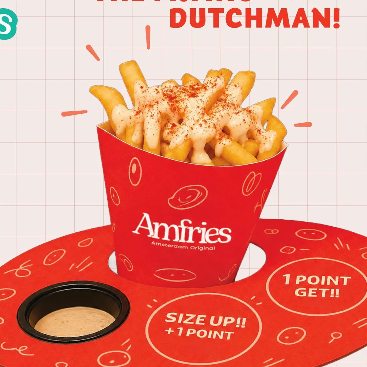
- Complete packaging design
- Digital menu systems
- Print collaterals
Each application follows the same underlying logic, ensuring the brand remains unified, legible, and consistent at every interaction.
Outcome
Amfries enters the Indian QSR space as a focused, product-first brand with a clear point of view. By resisting fast-food clichés and building a disciplined identity system, the brand stands apart through confidence rather than noise.
Designed as a cohesive and scalable system, Amfries is positioned to grow while maintaining clarity, recognition, and a strong, differentiated presence.
Selected applications of the brand system across touchpoints.
Working on something like this?
Tell us about the brand or business you're building. We reply within 24 hours.
Start a project