The Packaging Design Process: What Actually Happens Between Brief and Shelf
Founders see two moments of a packaging project: the concept deck and the finished pack in their hands. The work that decides whether the pack sells happens in between: the category audit, the structural call, the dieline, the print vendor, the press check. This is the full packaging design process as it runs inside a working studio in India, stage by stage, with the vendor realities, the costs, and the failure points between approval and shelf.
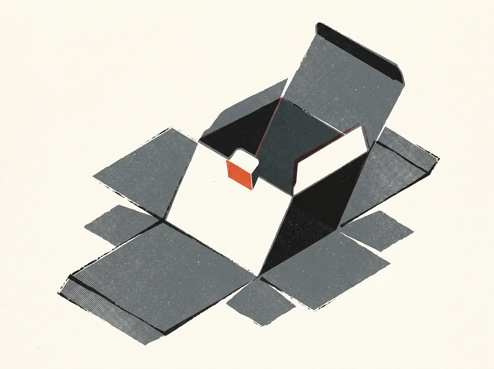
Most founders see two moments of the packaging design process: the concept presentation and the finished pack in their hands. Everything that decides whether the pack works, the category audit, the structural call, the dieline, the print vendor negotiation, the press check, happens between those two moments, mostly out of sight.
This is how packaging design works inside a studio that ships it, stage by stage, including the stages that go wrong. If you are about to brief a packaging design agency in India, or you are wondering why quotes for the same range run from ₹40,000 to ₹12 lakh, this is the map.
Stage 1: The brief, and the audit that fixes it
Most packaging briefs arrive as a mood board and a deadline. A usable brief carries five things the mood board never does: the exact price point and grammage, the channel mix (kirana, modern trade, quick commerce, D2C, in what proportion), the SKU roadmap for the next 18 months, the production reality (co-packer, converter, minimum order quantities), and the one thing the pack must say to a stranger.
We run this intake through the same Discovery Blueprint we use on every branding engagement, because packaging inherits every upstream ambiguity. If the positioning is fuzzy, the pack becomes a committee of claims.
Then the audit: buy the shelf. Physically purchase 20 to 30 competing packs, line them up, photograph them together, and map the category codes. Every category has them. Ghee lives in golden yellow and tradition cues. Chips colour-code their flavours. Premium coffee has gone matte black with white type.
The audit produces the two lists that drive everything after: codes to keep, so shoppers can find the category, and codes to break, so they notice you inside it. A pack that breaks every code reads as the wrong aisle. A pack that keeps every code disappears. The skill is choosing the one or two codes to violate on purpose.
Stage 2: Decide where the pack has to win
A pack is not seen in one place. The same SKU has to work at three distances that have nothing in common.
On quick commerce, the pack is a tile roughly 60 pixels wide in a scrolling grid. At that size a Blinkit or Zepto shopper sees a colour block, a logo shape, and maybe one word. Shrink your pack render to thumbnail size before you fall in love with it. If brand and variant do not survive the shrink, the design has failed a channel that now moves serious volume.
In a modern trade aisle, the test is three metres: does the brand block read across six facings while someone walks past with a trolley? Here the range matters more than any single pack.
In a kirana, the pouch hangs on a string, curled, in bad light, behind a counter. High contrast and a big, simple logotype forgive almost everything else.
The channel mix from the brief decides the hierarchy. A quick-commerce-first brand sets variant colour and product name enormous and moves the romance copy to the back. An exports-and-modern-trade brand can afford quieter fronts. Settle this before design starts, while the answer is still cheap.
Stage 3: Structure before graphics
Format is the loudest design decision, and it happens before any graphics. A glass jar and a stand-up pouch holding identical granola signal different price tiers from across the room. Structure also locks your print process, your minimums, and a chunk of your unit economics.
The honest Indian menu:
- Stock container plus printed label. Fastest and cheapest. Digital label runs start around 500 to 1,000 labels, so a founder can launch three SKUs for tens of thousands of rupees, not lakhs.
- Printed laminate pouch. The default for snacks and staples. Beautiful when done well; the print economics arrive in Stage 4.
- Mono carton. Offset printed, cheap plates, workable minimums from roughly 1,000 to 3,000 units, and six faces to design.
- Custom structure. A proprietary bottle or jar is real differentiation, and it costs like it: mould development in India typically starts around ₹2 to 5 lakh and adds two to three months before the first unit exists.
The studio's job here is to stop the founder buying a custom mould for an unproven product, and to stop the opposite mistake too: shipping a premium price point in a format the category reads as economy.
Stage 4: The dieline is the real canvas
Nobody should design a pouch on a rectangle. The working surface is the dieline: the flat, dimensioned template of the pack with every seal, fold, gusset and overlap marked. It comes from your converter, not from the internet, and two converters running the same pouch size will hand you two different dielines.
The dieline carries the constraints that shape the layout: seal areas where critical type cannot sit, the eye mark that form-fill-seal machines use for registration, the back-seal overlap that eats a centimetre of the back panel, the gusset folds that crease anything placed across them.
This stage is also where the print process gets chosen, and in India the process is the budget:
- Rotogravure dominates flexible packaging. Every colour needs an engraved cylinder at roughly ₹4,000 to 8,000 each. A 7-colour design across 12 SKUs is 84 cylinders before a single pouch prints. Converters also want volume: printed laminate minimums commonly start around 200 to 300 kg per design, which can mean 20,000 to 60,000 pouches per SKU depending on pouch size.
- Flexo trades some finesse for cheaper plates and mid-run economics.
- Digital flexible printing now exists at Indian converters, with minimums of a few thousand pouches at a higher per-unit rate. It is the correct first run for most young brands: print 5,000, learn from the market, then engrave cylinders once velocity is proven.
Design follows the process. Neon brights and fine gradients that glow on screen will not hold on gravure over metallised film, and every extra colour is a cylinder cost multiplied by your SKU count.
Stage 5: The label layer nobody briefs for
Every Indian pack carries a mandatory layer: MRP inclusive of all taxes, net quantity, the manufacturer or packer's name and address, month and year of manufacture, consumer care details. Food adds the FSSAI licence number and logo, the veg or non-veg mark, an ingredient list, a nutrition panel and date marking. Several of these carry minimum type sizes tied to pack dimensions, and the barcode needs its quiet zone and a printable background to scan.
None of this is optional, and all of it occupies the same panel your brand does. Studios that treat the legal layer as a footnote produce packs where compliance gets stickered on later, crooked, over the design. The better method is to draw the compliance blocks onto the dieline before the creative starts and design inside them, the same way you respect the seal areas.
Stage 6: Range architecture, or how 12 SKUs stay one brand
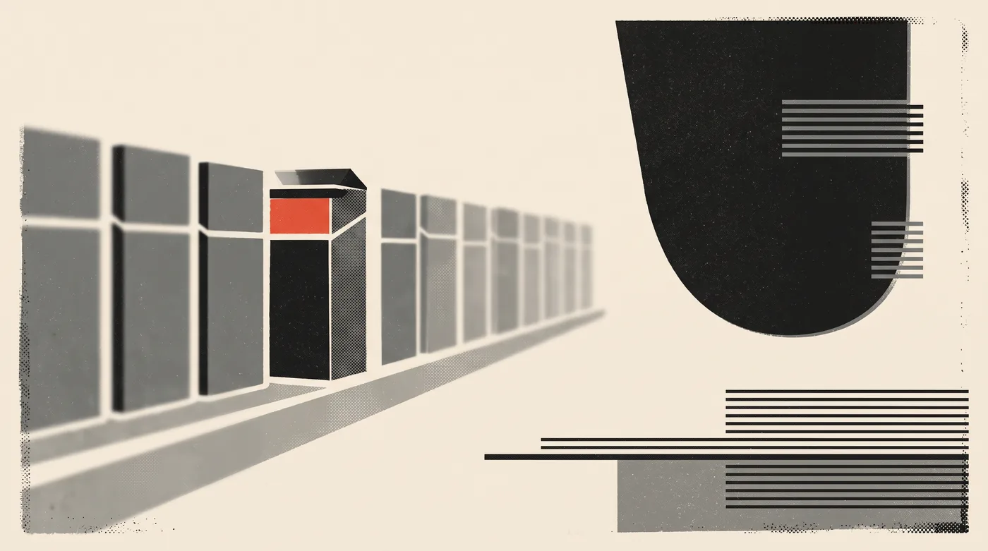
A single pack is a poster. A range is a system, and ranges are where packaging design actually gets hard. The discipline is deciding what is fixed and what flexes.
Fixed: logo position and size, the layout grid, the type system, the placement of the mandatory layer. Flexed: variant colour, flavour cue, photography or illustration, the name lockup. Done right, the brand reads at three metres, the category at one metre, the variant at arm's length, and twelve facings merge into one unmissable brand block on shelf.
This is the same logic that let Lucky Chan's identity scale across outlets for seven years: build the system, not the artefact. And a system only survives if it is written down. SKU 13 will be designed in a hurry, 18 months from now, possibly by someone else. The range rules belong in guidelines a real team can actually follow, with dielines and colour standards attached.
Stage 7: Prototypes, proofs, and the press check
Screens lie about packaging. They lie about scale, they lie about finish, and they cannot show you a shelf. So the process forces three physical checkpoints.
First, true-size mockups in week one or two. Print the front on paper, wrap it around the actual jar or fold the actual carton, and stand it next to the competitors you bought in Stage 1. Half the hierarchy debates end here.
Second, the contract proof from the converter, on or close to the real substrate. This printed sheet, not a PDF, is what production gets measured against. Approve it in decent light, sign two copies, keep one.
Third, the press check. When the first production run prints, someone stands at the press and checks colour against the signed proof, registration, statutory text spelling character by character, the barcode scanning off the actual laminate, seal areas clear, matte and gloss varnish sitting where they should. An hour at a press in Peenya or Vasai saves a lakh of misprinted laminate.
What goes wrong between approval and shelf
The gap between "approved" and "on shelf" is where packaging projects actually fail. The recurring failures, from the inside:
- Legal copy arrives late. Nutrition values come from the final lab report, which lands after the artwork was declared final. If cylinders were engraved early, they get engraved twice. Freeze legal copy before plates or cylinders are made.
- The vendor redraws the art. Converters adapt artwork to their machines, and elements move. Insist on reviewing their final production file against your dieline before engraving.
- Colour drifts across substrates. The terracotta approved on a coated proof turns muddy on kraft. Anchor brand colours as spot colours or signed printed standards per substrate, not as a hex code in a PDF.
- The barcode fails. Reversed-out barcodes, barcodes over foil, barcodes wrapped around a gusset. Retail and quick-commerce scanners are unforgiving; verify a printed sample, not the artwork.
- The coder prints over the art. Batch number and dates are inkjet-printed at the plant. If the artwork leaves no clear, light, matte zone, they land on dark graphics, illegibly. Reserve the coder panel in the design.
- The MRP changes. Grammage or pricing shifts after printing, and 40,000 pouches now carry the wrong declaration. Print runs should follow pricing decisions, not precede them.
What the packaging design process costs in India
Design fees, separate from print costs, and quoted + GST across the market:
- Freelance designer, one SKU on a stock structure: ₹20,000 to 60,000. You get graphics, rarely an audit, a dieline check or print liaison.
- Independent studio, small range of 3 to 6 SKUs: ₹1.5 to 4 lakh, because the fee buys the category audit, a range system, artwork on real dielines and a compliance pass, not just a front face.
- Retainer-grade studio in Bangalore or Mumbai, full process across 8 to 15 SKUs: ₹4 to 12 lakh, with structure exploration, claims work, print management and press checks inside scope. The team is senior and the vendor liaison alone runs for weeks.
- Large brand consultancies: ₹15 lakh upward, usually justified only when the range is national and the research burden is real.
- Per-SKU extensions once the system exists: ₹15,000 to 40,000, which is the payoff of Stage 6 done properly.
What actually moves the number: SKU count, custom structure or not, illustration and photography production, compliance complexity, and how much of the print vendor's job the studio absorbs.
How to choose a packaging design agency in India
The portfolio tells you less than these five checks:
- Ask to hold their printed work. Renders hide everything that matters. A studio that ships packaging owns physical samples.
- Count their questions about your converter. A studio that never asks about minimums, dielines or print process is planning to hand you a JPEG.
- Listen for compliance questions in the first call. FSSAI category, Legal Metrology declarations, barcode ownership. Silence here means stickers later.
- Look for range logic, not hero packs. One gorgeous jar proves taste. Twelve SKUs that read as one brand prove a system.
- Check whether the press check is in scope. If nobody from the studio intends to see the first production run, the last ten percent of quality belongs to no one.
FAQ
How long does the packaging design process take?
For a small range on stock structures, 6 to 10 weeks of design, then 4 to 8 weeks of proofing, printing and production depending on the process and the converter's queue. A custom structure adds two to three months for mould development. Compressed timelines exist; they usually spend their savings on reprints.
Can design start before the product is final?
Yes. Structure, system and creative can run in parallel with formulation. The hard rule: legal copy (nutrition values, net quantity, licence numbers) freezes before plates or cylinders are made.
Should I approve renders or physical samples?
Approve nothing that matters on a screen. Judge hierarchy on true-size prints, colour on substrate proofs, and the range on a mocked-up shelf.
Does quick commerce need its own packaging?
Usually the same physical pack, tested at thumbnail size, plus a disciplined set of pack-shot images for listings. The pack does not change; the hierarchy does.
The pack is the cheapest media you will ever buy
A pack is the only ad every customer is guaranteed to see, hold, and keep on a kitchen shelf. At 50,000 units a run it is also the cheapest media you will ever buy, which is why this process exists: not to make one beautiful object, but to make the ten-thousandth unit come out exactly as intended, legally, on a real machine, at speed.
Run the stages in order. Audit before creative, structure before graphics, dieline before artwork, compliance inside the grid, press check before celebration. Brands that skip stages pay for them later, at print-run prices.
NOW Media is a Bangalore creative studio founded in 2019, a brand of Bleep Design Private Limited. Packaging systems are part of the studio's branding practice.
Packaging design
What happens between brief and shelf, and the Indian statutory rules founders discover too late.