Lola's - Personality Led Cocktail Brand
Lola's
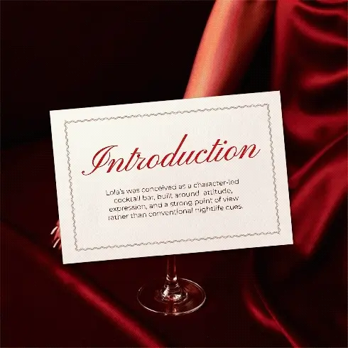
ntroductionLola’s was conceived as a character-led cocktail bar, built around attitude, expression, and a strong point of view rather than conventional nightlife cues.
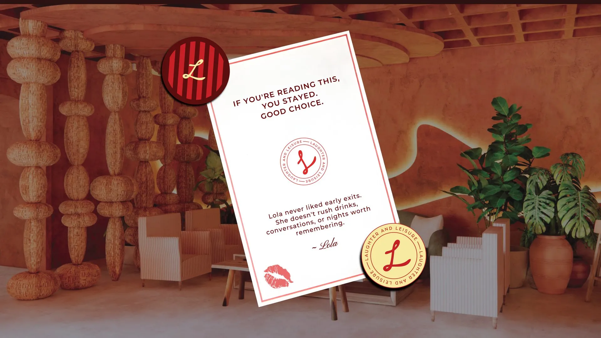
We were brought on to build Lola’s from the ground up, defining both her visual identity and the language she would speak across space, print, and experience. Lola was imagined as a presence rather than a concept. Confident, playful, indulgent, and unapologetically vocal, she speaks directly to guests through her words, her rules, and the marks she leaves behind. Every brand decision was guided by how Lola would show up and how she would be felt.
Brand Identity
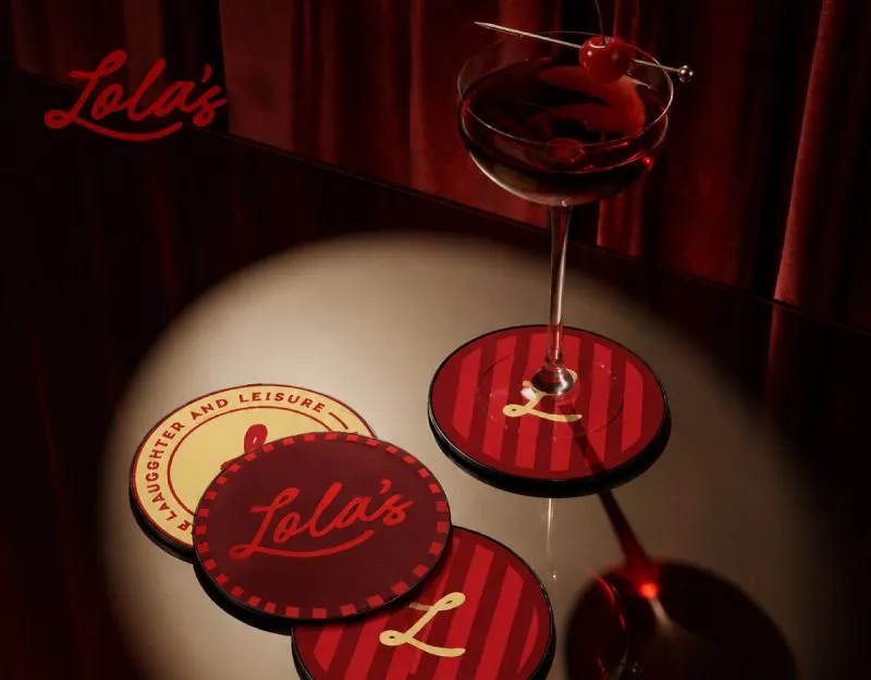
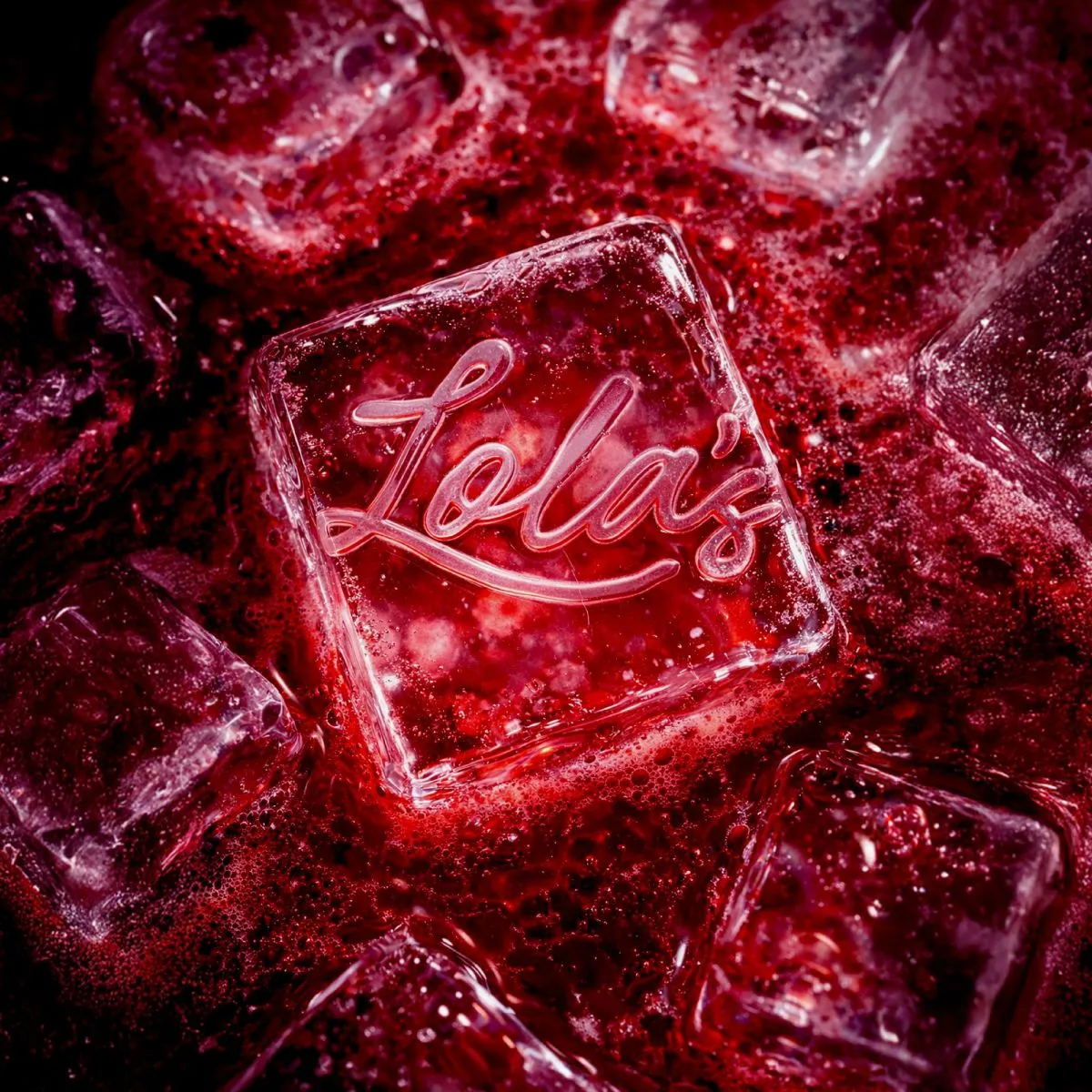
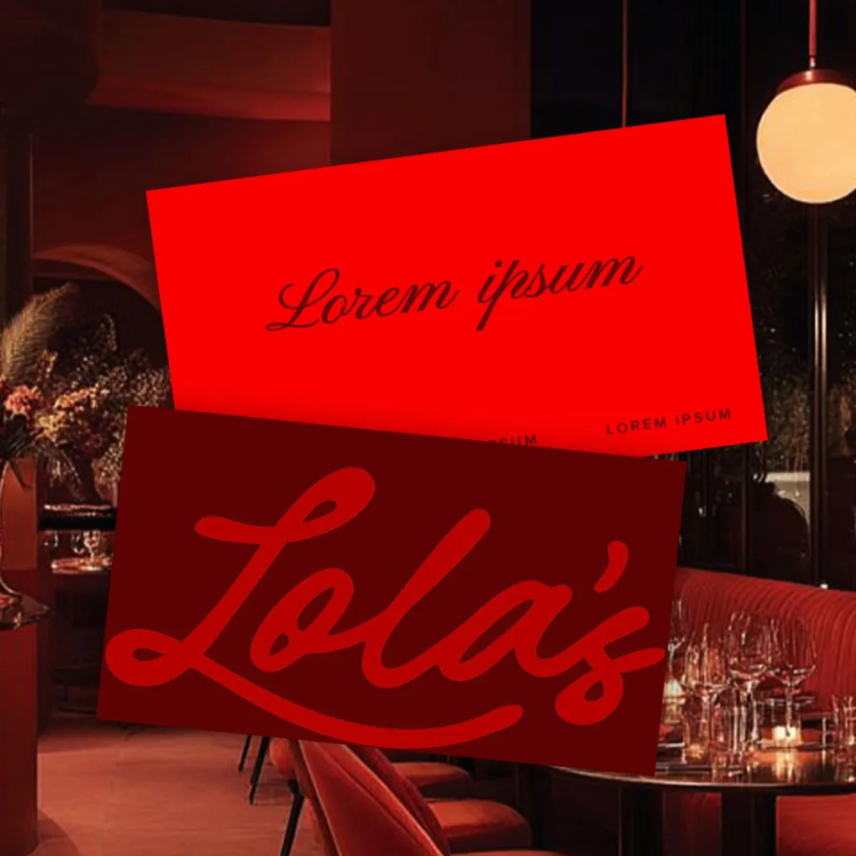
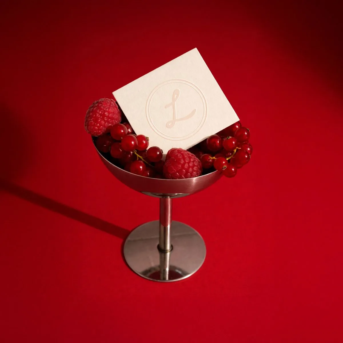
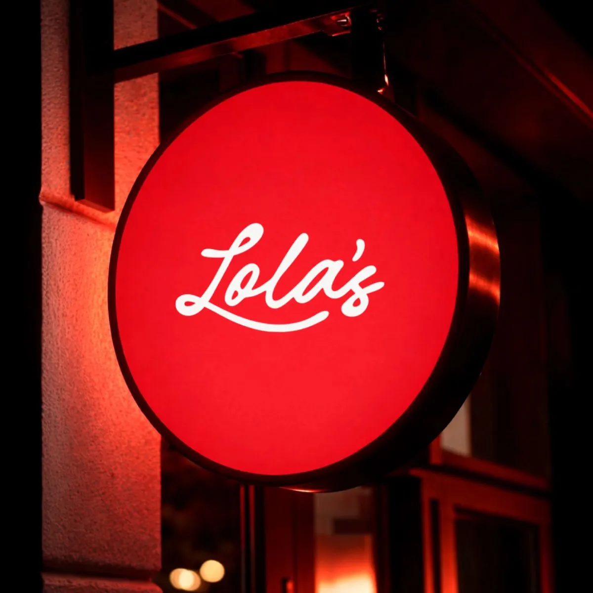
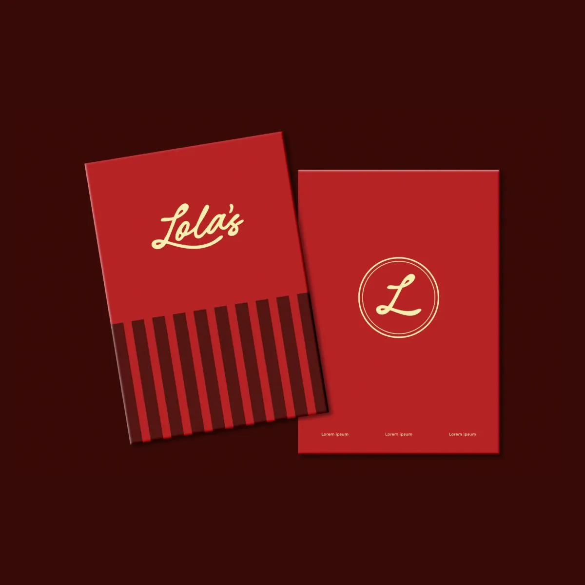
Logo DesignThe Lola’s wordmark was designed as a handwritten, running script to feel personal, expressive, and slightly unfiltered. More signature than symbol, the logo reads like something Lola herself might have left behind rather than a constructed mark.
Its fluid form allows it to move naturally across menus, packaging, signage, and spatial applications, behaving less like a fixed logo and more like a recurring gesture throughout her world.
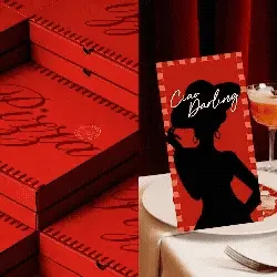
Colour PaletteRed plays a defining role in Lola’s visual language. Used boldly and unapologetically, it reflects the brand’s energy, indulgence, and sense of drama. Colour is treated as a signal rather than an accent, setting the tone for the experience before a word is read or a drink is ordered.
Supporting colours are used selectively to create contrast and balance across menus, print, and spatial graphics, allowing the identity to remain expressive without losing focus.
TypographyTypography was chosen to support Lola’s voice. Direct, conversational, and confident, the type system allows copy to feel handwritten, opinionated, and playful, while neutral companions ensure clarity and legibility across longer formats.
Together, the typography enables the brand to shift effortlessly between statements, notes, rules, and asides, reinforcing the sense that Lola is always speaking to you.

Design ApproachThe identity was developed as a cohesive visual and spatial system, extending across menus, stationery, packaging, coasters, posters, environmental graphics, and in-bar communication.
Each touchpoint was designed as part of a larger narrative rather than as an isolated application. Copy, graphics, and spatial elements work together to create a consistent brand world where Lola’s personality is felt at every interaction. All applications were documented within a comprehensive brand book to ensure clarity and continuity.
OutcomeThe resulting identity positions Lola’s as a distinctive, personality-led bar defined by character rather than convention.By anchoring the brand in a clearly articulated persona and allowing that persona to guide every visual and spatial decision, Lola’s establishes a strong presence that feels expressive, immersive, and unmistakably hers.
Selected applications of the brand system across touchpoints.
Working on something like this?
Tell us about the brand or business you're building. We reply within 24 hours.
Start a project