Brassa
A Minimal, Chic & Sophisticated F&B Identity
Scope of Work
Brassa was created to be more than just a restaurant—it’s an all-day dining space that feels effortless, refined, and globally inspired. Designed to reflect quality, style, and understated sophistication, the branding needed to be fresh, inviting, and adaptable, mirroring the light-filled interiors and international cuisine.
Our approach focused on crafting an elegant yet flexible brand identity, ensuring that Brassa remains open to interpretation, allowing guests to shape their own experience within the space.
Brand Identity & Visual System
- The name ‘Brassa’ was intentionally created as a fictitious word, free from preconceived meanings, allowing the space to take on a fluid identity shaped by its guests.
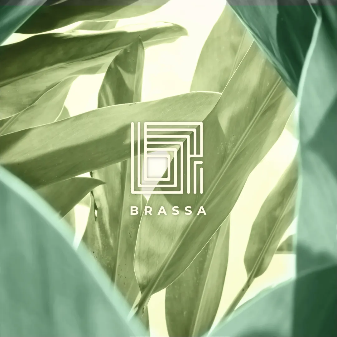
- A versatile wordmark-logomark combination was designed to ensure flexibility across applications, from signage to digital branding.
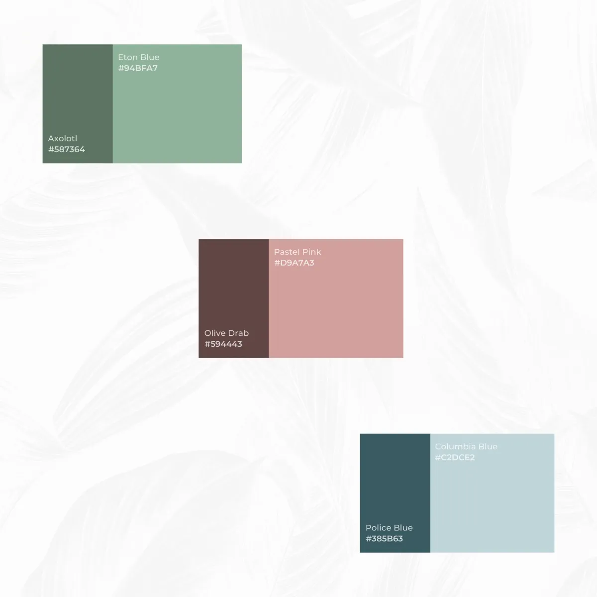
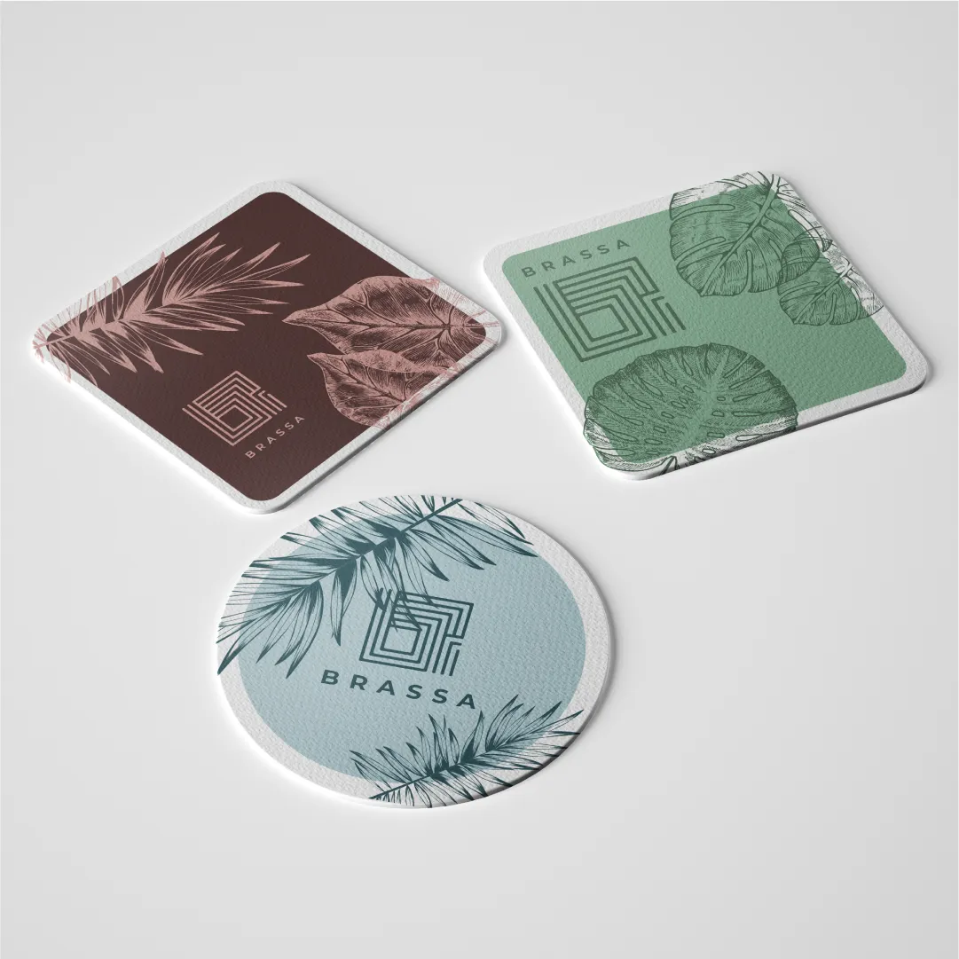
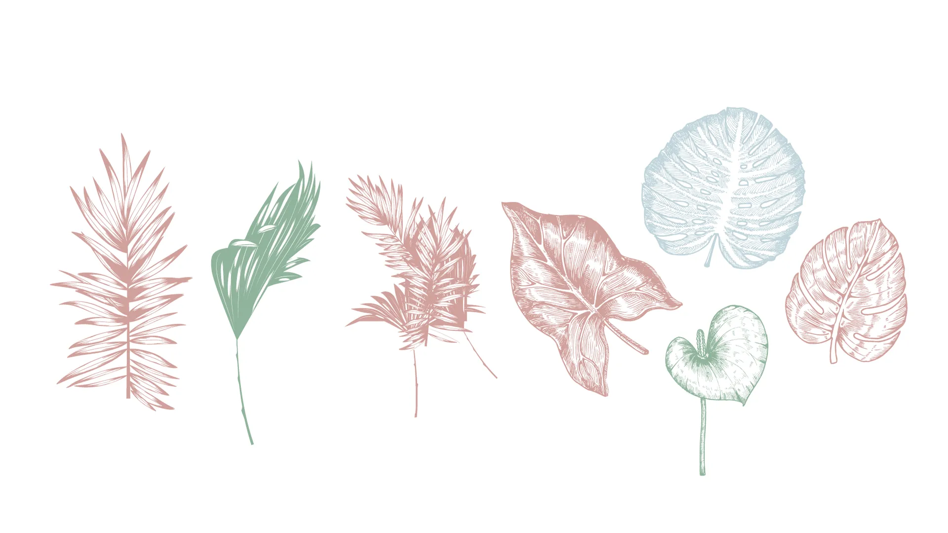
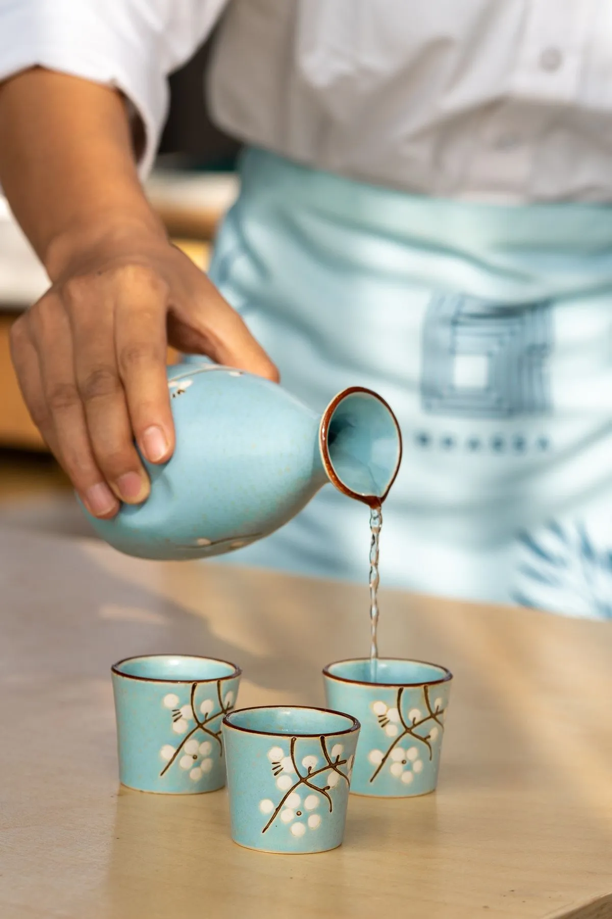
- The color palette blends soft tones like Columbia Blue and Pastel Pink with deeper shades, maintaining a fresh yet grounded aesthetic.
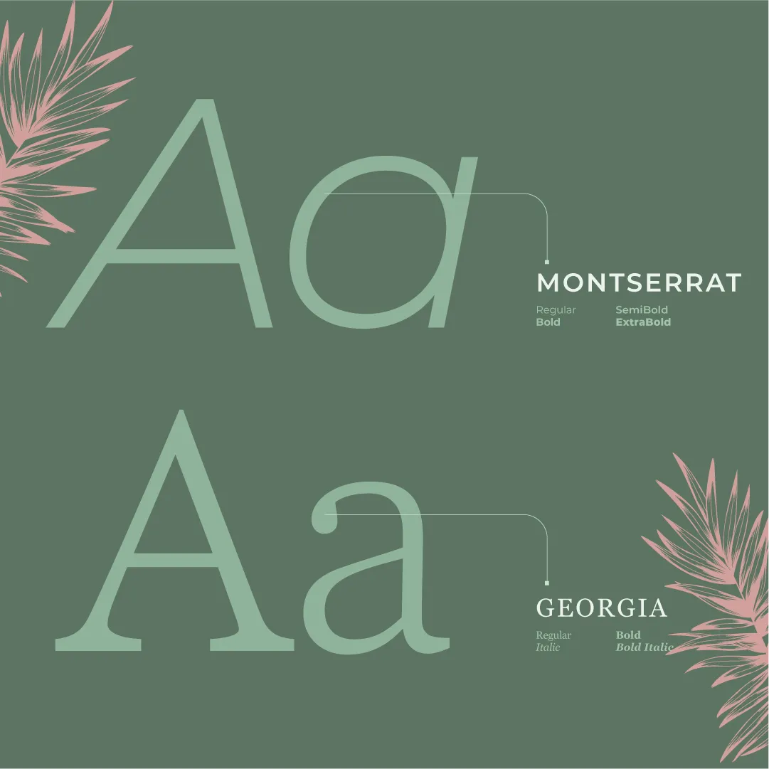
- Typography choices—Georgia and Montserrat—merge classic elegance with modern simplicity, reinforcing the brand’s balance of refinement and approachability.
Spatial Branding & Guest Experience
- Laser-cut LED signage was designed to subtly enhance the space, creating an identity that feels integrated rather than overpowering.
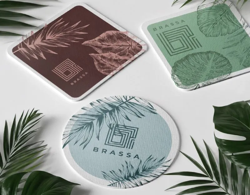
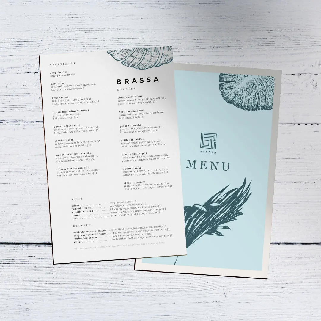
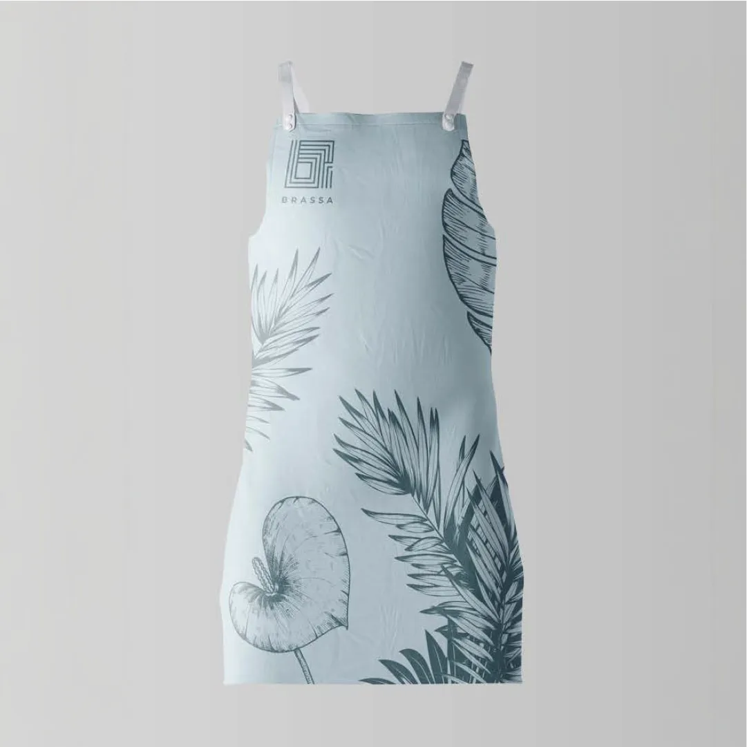
- Menus, coasters, and branded aprons were crafted with minimalist sophistication, ensuring that branding elements feel seamless and understated.
- Lighting and spatial branding were carefully considered to ensure the restaurant felt bright, airy, and welcoming, avoiding the heaviness of traditional fine dining.
Storytelling & Brand Messaging
- The brand’s content strategy and copywriting were crafted to reinforce a relaxed, sunlit, and effortlessly chic atmosphere.
- Launch campaign phrases such as ‘Sun-Kissed Lunch Vibes,’ ‘Good Vibes & Great Times,’ and ‘Here Comes the Sun’ emphasized the easygoing, warm, and welcoming nature of Brassa.
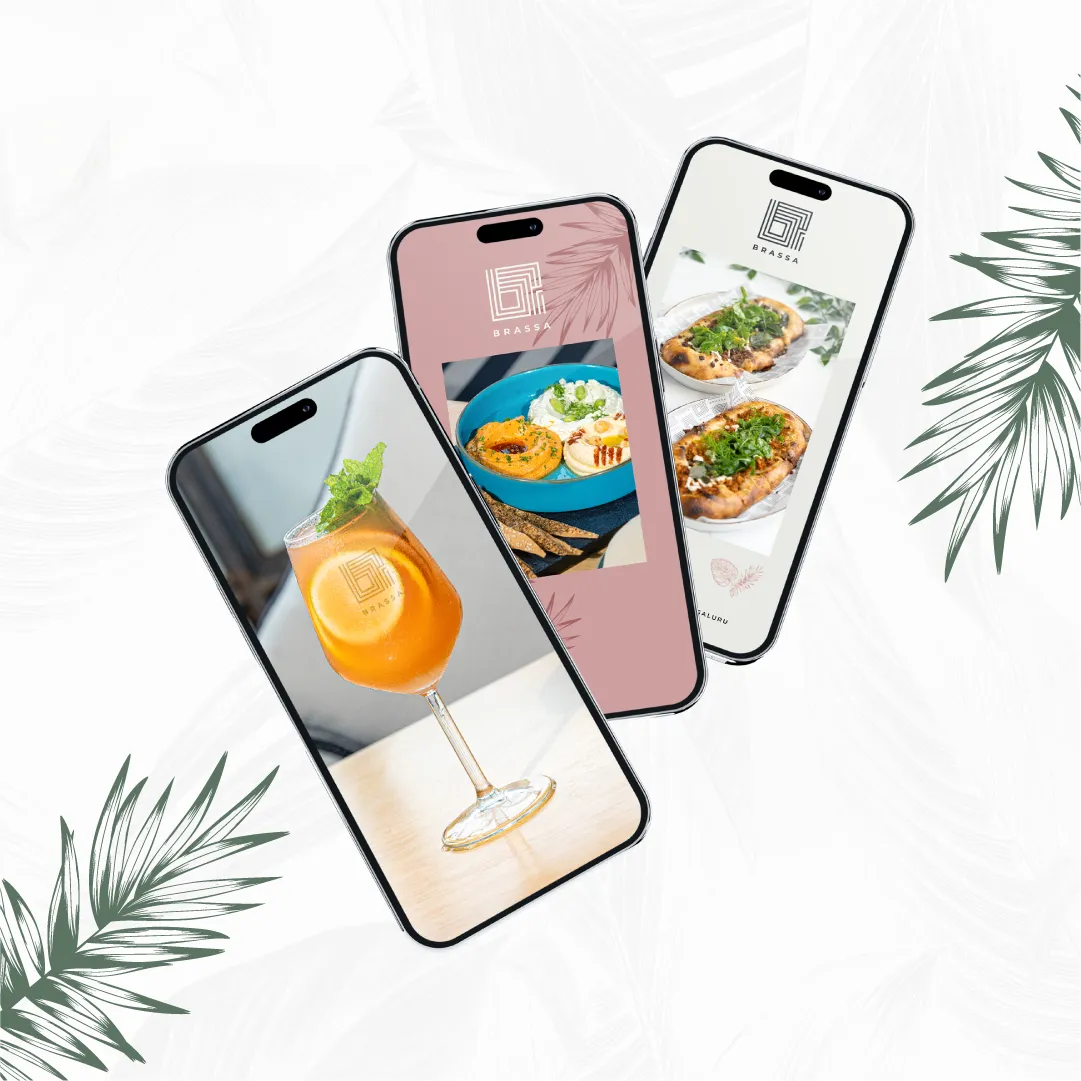
- Social media and marketing materials used subtle shadows and natural light photography, reinforcing the breezy, all-day dining feel.
Impact
With a timeless yet flexible brand identity, Brassa now stands as a sophisticated yet approachable dining space that allows guests to define their own experience. Every branding element—from the color palette to the copywriting—was designed to reflect brightness, warmth, and effortless charm, ensuring Brassa is not just a restaurant, but a feeling.
Selected applications of the brand system across touchpoints.
Working on something like this?
Tell us about the brand or business you're building. We reply within 24 hours.
Start a project