Eravoo - Montessori Branding
Eravoo
Eravoo Centre of Learning is a progressive preschool rooted in nature-based philosophies. It fosters curiosity, emotional intelligence, and individuality through experiential, play-driven education inspired by Finnish, Japanese, and indigenous Indian models.
Logo Design
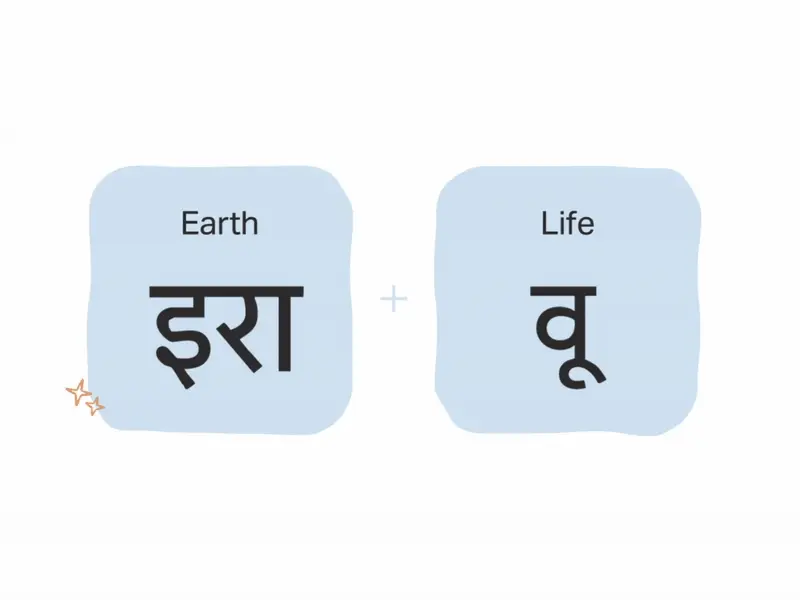
The logo, drawn from “Ira” (Earth) and “Vu” (Life), combines structure and fluidity. Its clean geometry symbolizes balance between grounding and growth, reflecting Eravoo’s nurturing, exploratory approach.
Colour Palette & Typeface
A calm, earthy palette - Jade, Blush, Ocean Teal paired with Aktiv Grotesk type evokes warmth, clarity, and intentionality, aligning with the school’s nurturing ethos.

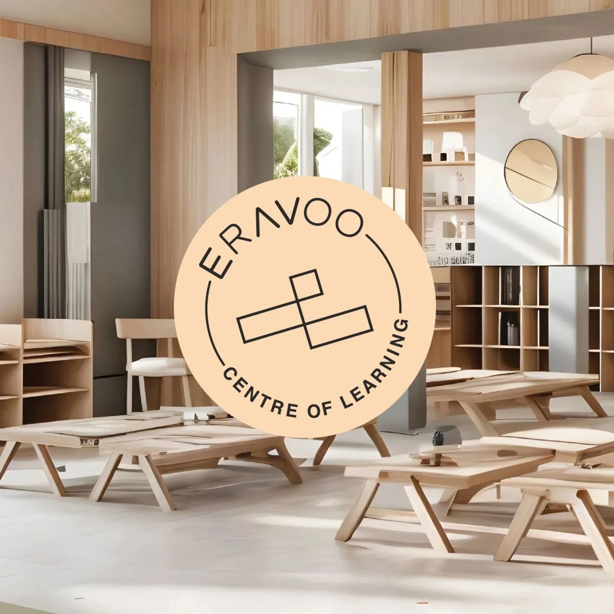
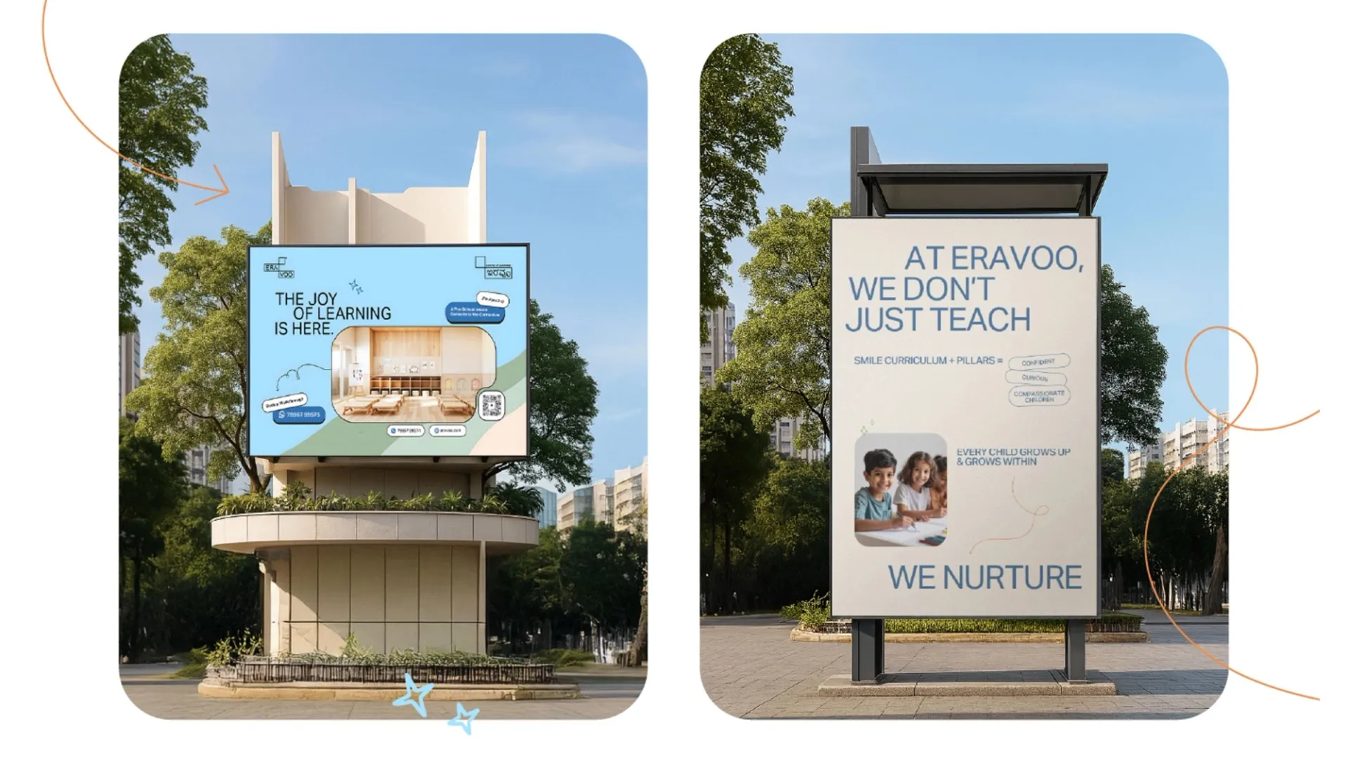
Spatial Branding
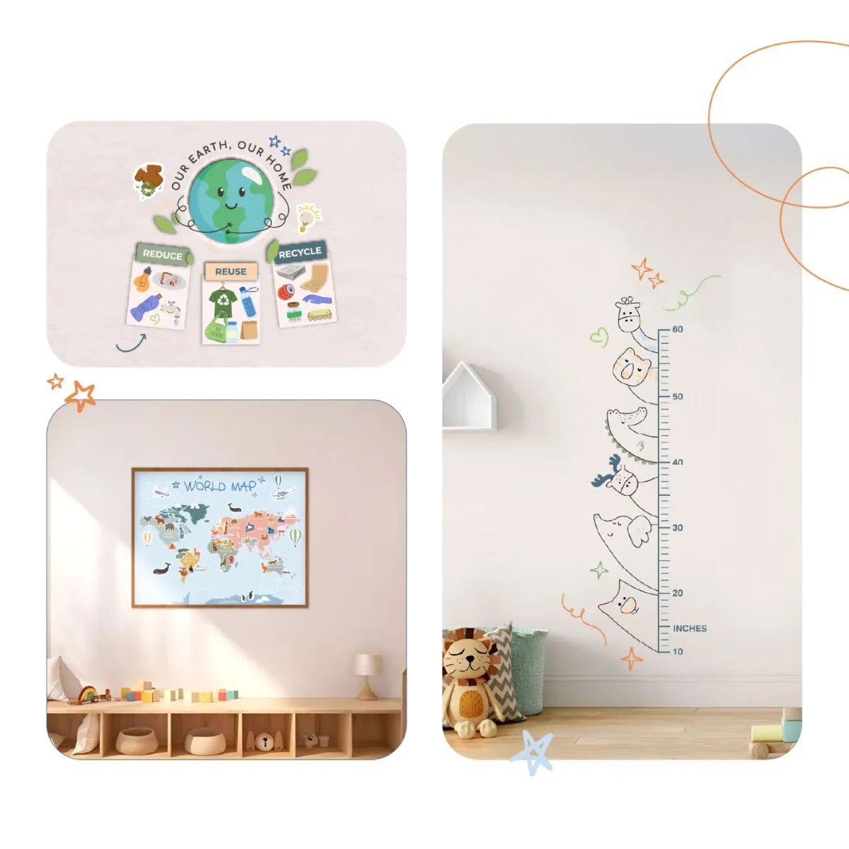
Eravoo’s physical environment was designed as a seamless brand experience from the welcoming façade signage and to the founder’s room, every space is intentional. Classrooms and corridors use child-friendly, premium finishes with acrylic surfaces and playful elements, keeping safety and sensory engagement in mind. The brand palette flows through curated furniture, wall graphics, and interactive displays. Event branding zones like parent meet areas - extend the visual identity, reinforcing a consistent, immersive atmosphere that balances elegance with approachability.
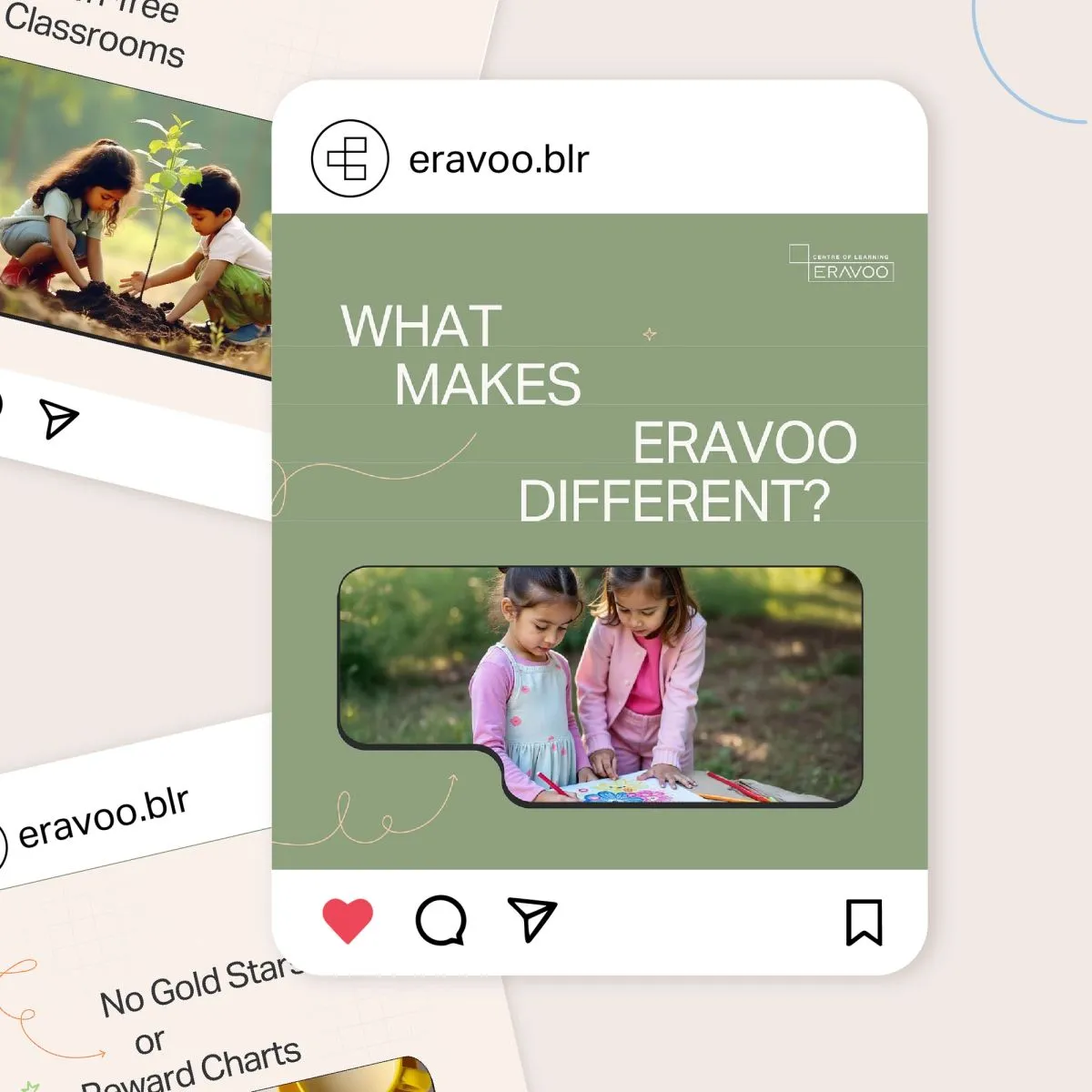
Social Branding
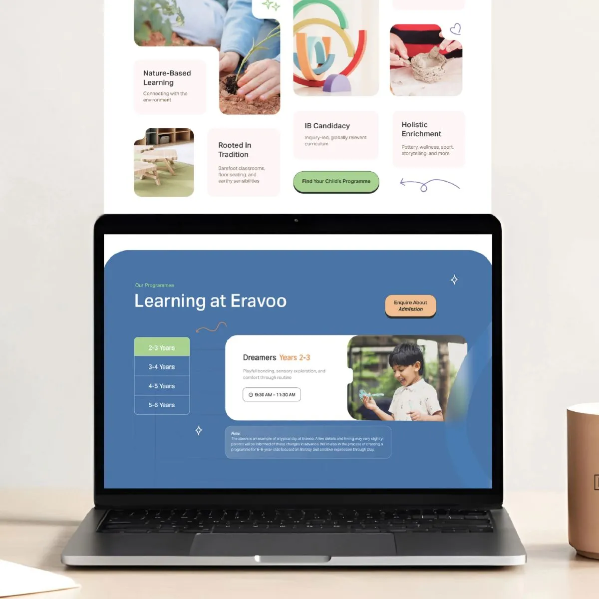
Online communication is warm and mindful, spotlighting real moments and parent-child engagement. Visuals use natural light and minimal styling to stay true to Eravoo’s grounded, authentic tone.OutcomeA cohesive brand built end-to-end, from print to digital. Thoughtfully crafted UI designs, consistent use of brand colours, and a minimal yet premium visual language align seamlessly with the values of a modern Montessori school for young learners.
Outcome
A cohesive brand built end-to-end, from print to digital. Thoughtfully crafted UI designs, consistent use of brand colours, and a minimal yet premium visual language align seamlessly with the values of a modern Montessori school for young learners.
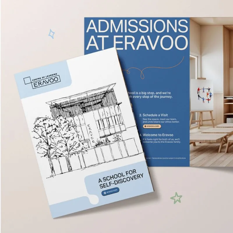
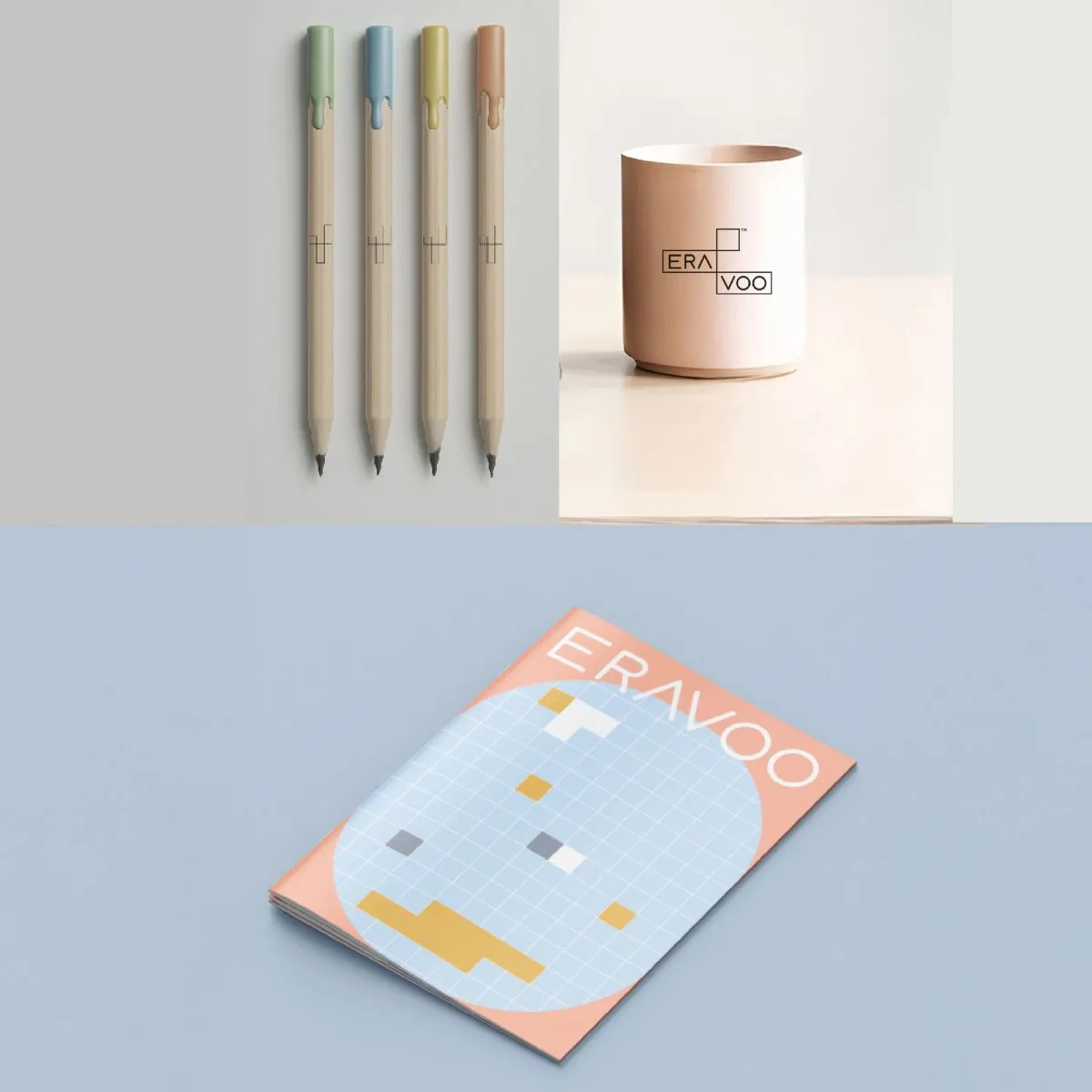
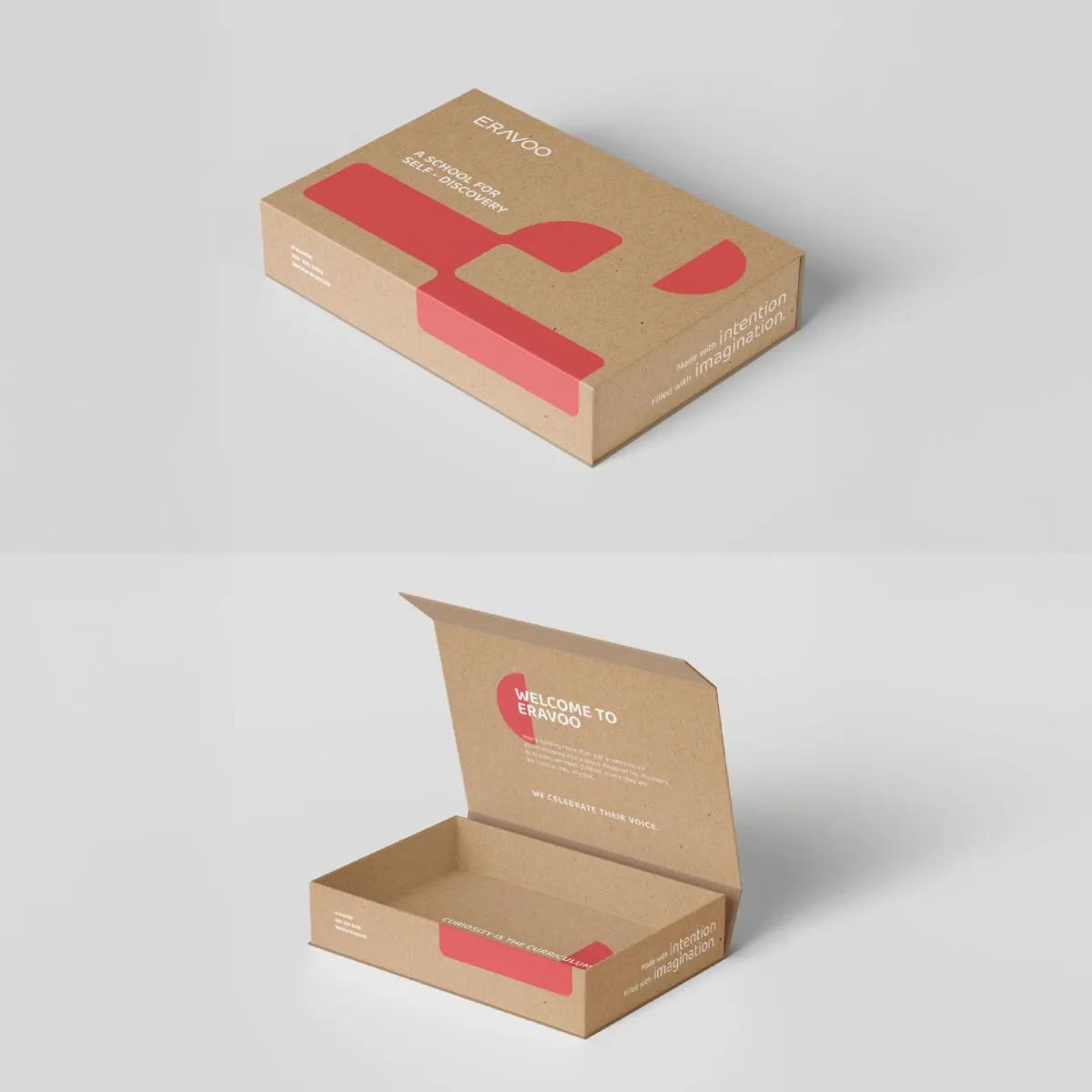
Selected applications of the brand system across touchpoints.
Working on something like this?
Tell us about the brand or business you're building. We reply within 24 hours.
Start a project