Amicii - A Brand Built on Connection
Amicii
Amicii is a brand shaped by feeling. It transforms the idea of a restro-bar into a space for meaningful presence. Every element is designed to hold emotion with intention. The experience is not about performance, it is about presence.
Naming
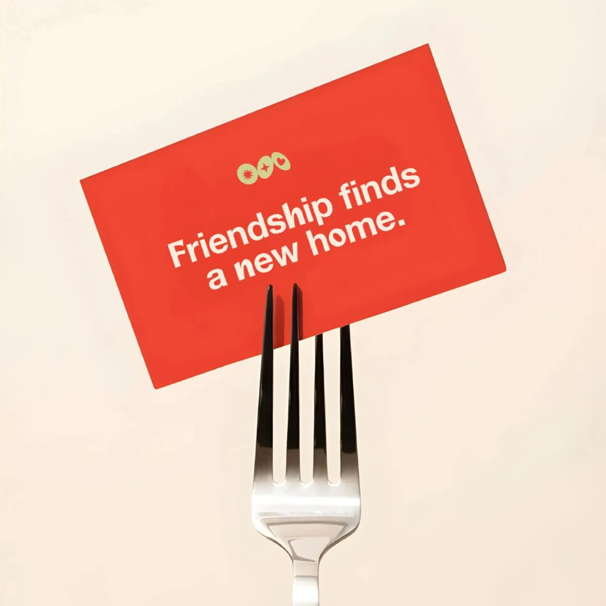
The name Amicii is drawn from the Italian word for friends. It speaks to the brand’s foundation in warmth, closeness, and shared memory. The triple i is a deliberate choice. It references the space’s former identity, Three Dots and a Dash, preserving the three dots as part of its visual and conceptual legacy. The name becomes a bridge between where it came from and what it is becoming.
Logo
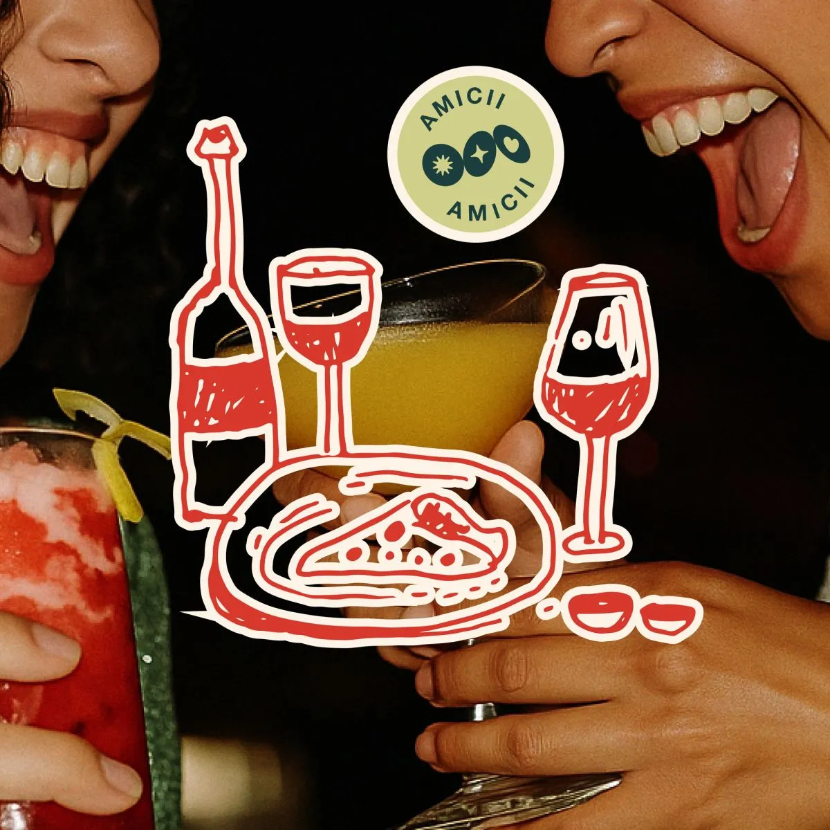
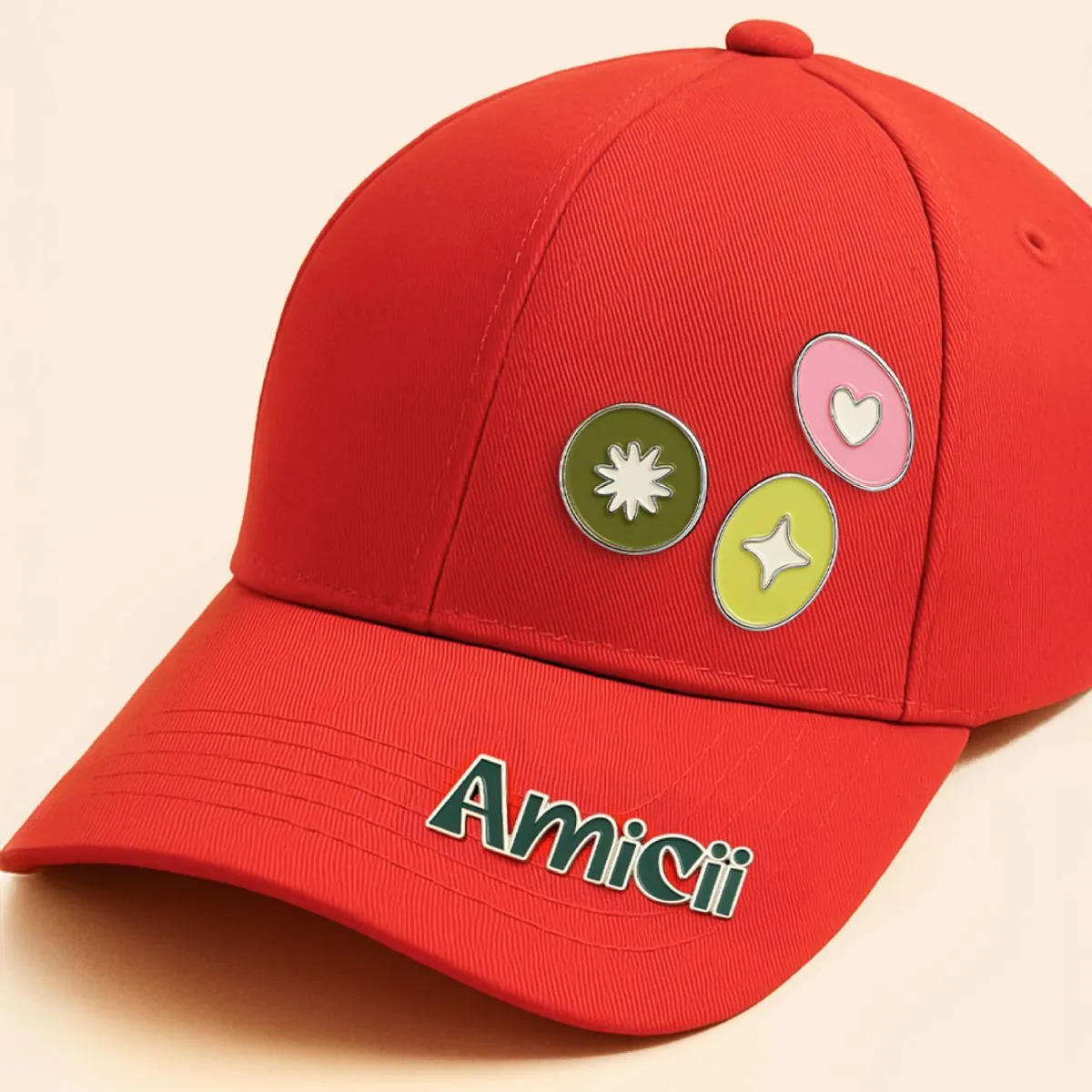
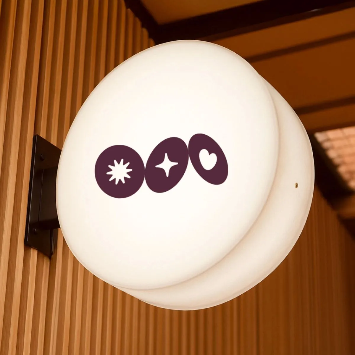
The logotype is expressive and human. It is accompanied by three distinct dots, each representing one of Amicii’s emotional pillars - Joy, Trust and Love. These elements come together to form a symbol system that is immediately recognisable and emotionally resonant.
Visual Identity
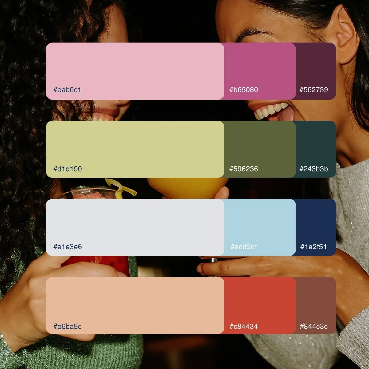
The visual system is calm and layered. A palette of softened pastels and grounded accents reflects the emotional range of the brand. Typography is led by Helvetica Neue for clarity and discipline. It is supported by Mozie and Georgia which introduce character and intimacy. The combination allows the identity to shift between tonalities while maintaining coherence.
Brand World
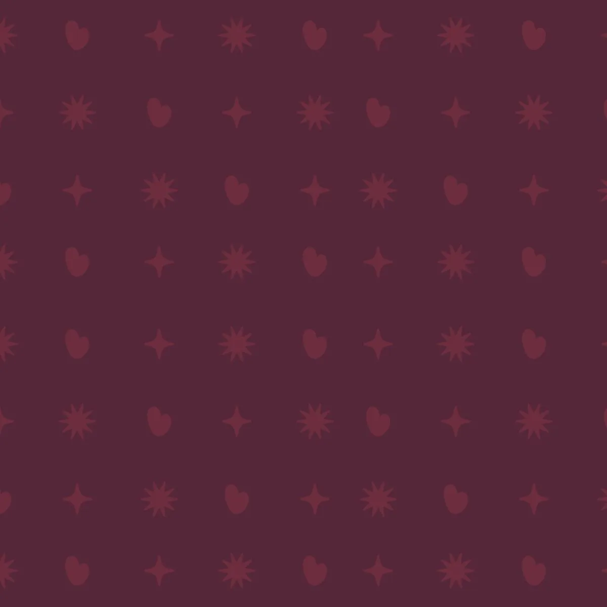
Every touchpoint is treated as an opportunity to evoke memory. The visual language borrows from the handmade and the personal. Textures are tactile. Patterns are drawn, not generated. There is a scrapbook sensibility that suggests this brand is collected rather than constructed. From packaging to signage, every expression is considered and cohesive.
Impact
Amicii is not designed to impress. It is designed to connect. The identity is understated, emotionally intelligent and grounded in lived experience. This is branding that invites rather than insists. The result is a space that feels familiar from the first moment and worth returning to again and again.
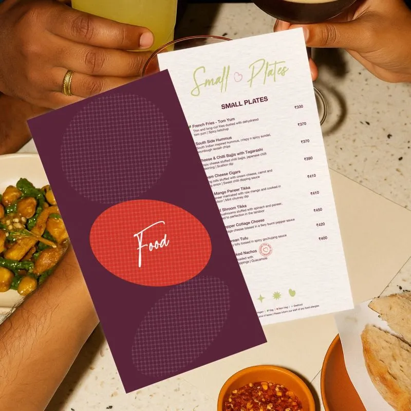
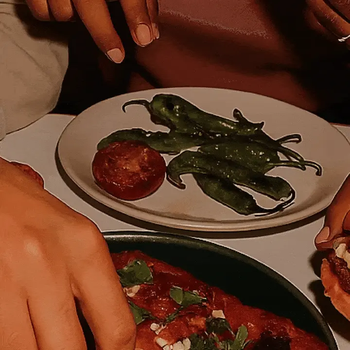
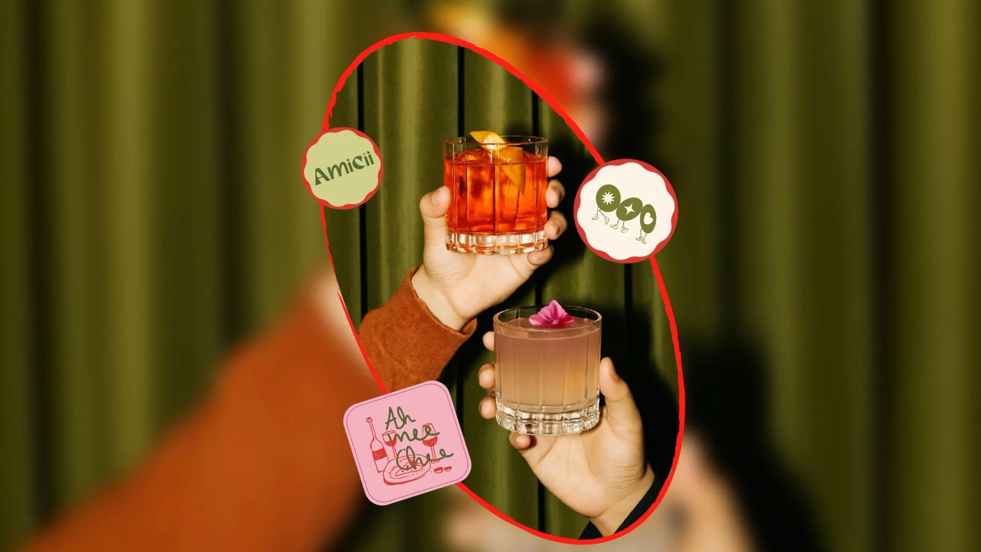
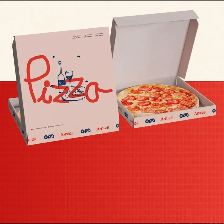
Selected applications of the brand system across touchpoints.
Working on something like this?
Tell us about the brand or business you're building. We reply within 24 hours.
Start a project