IZA
Branding For A Pan-Asian Kitchen + Izakaya
Scope of Work
IZA isn’t just a restaurant—it’s a space that shifts with the energy of the day. Designed as the city’s first Izakaya-inspired pan-Asian kitchen, it serves as a casual lunch spot for professionals and families before transitioning into a buzzing, high-energy space by night. Located in a tech park, it brings together bold flavors, a lively atmosphere, and a unique dining experience, complete with a sushi belt at its center.
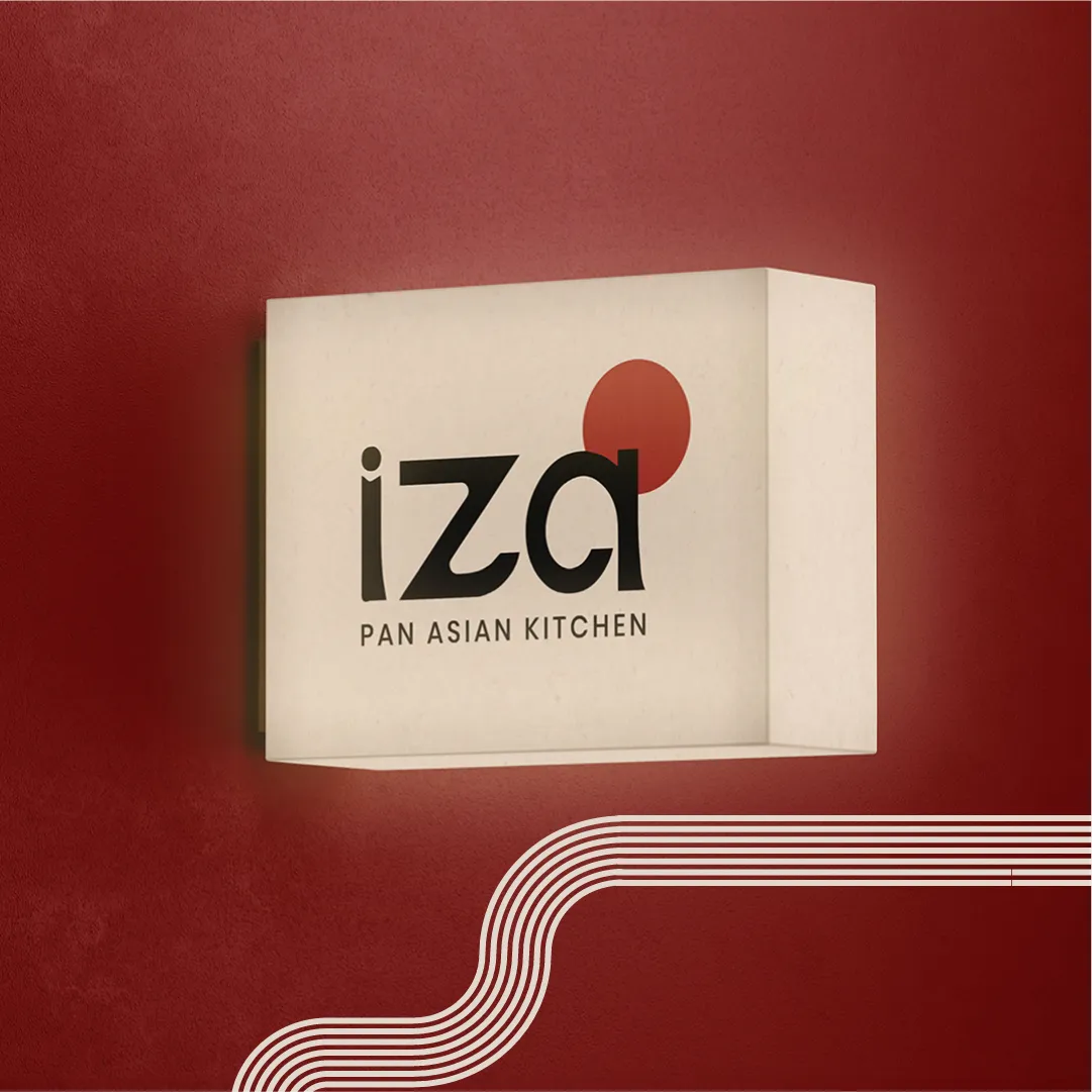
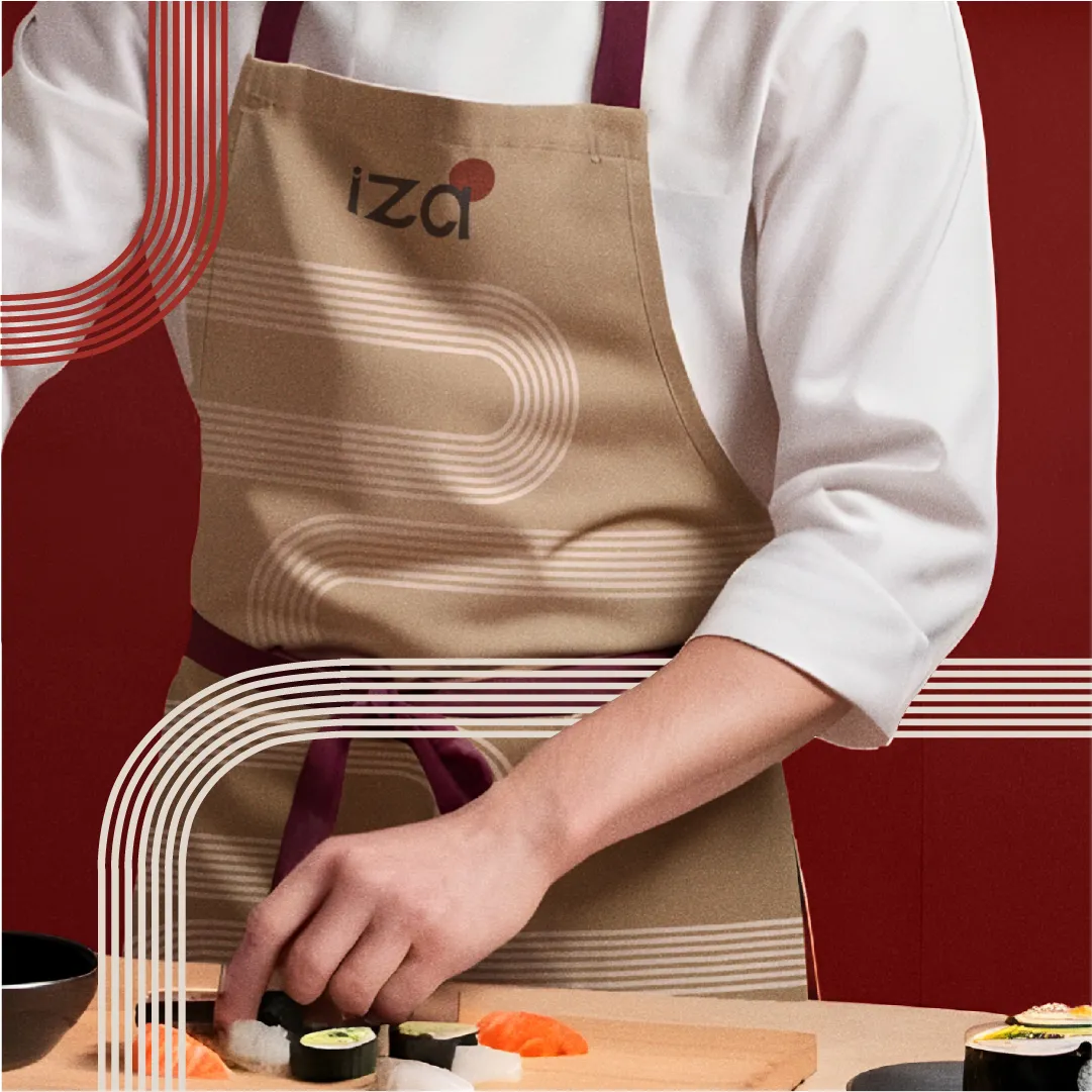
Logo & Visual Identity
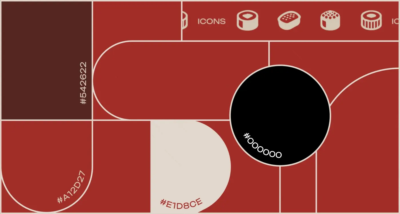
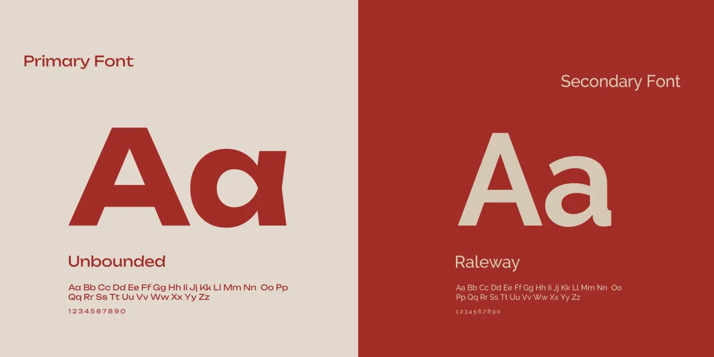
The IZA logo reflects the balance between boldness and simplicity, making a strong impression while staying versatile across applications. A color palette of deep reds, muted neutrals, and inky blacks creates contrast and depth, echoing the dynamic shifts in the space throughout the day. Typography choices keep the branding clean yet impactful, ensuring a strong presence across signage, menus, and digital platforms.
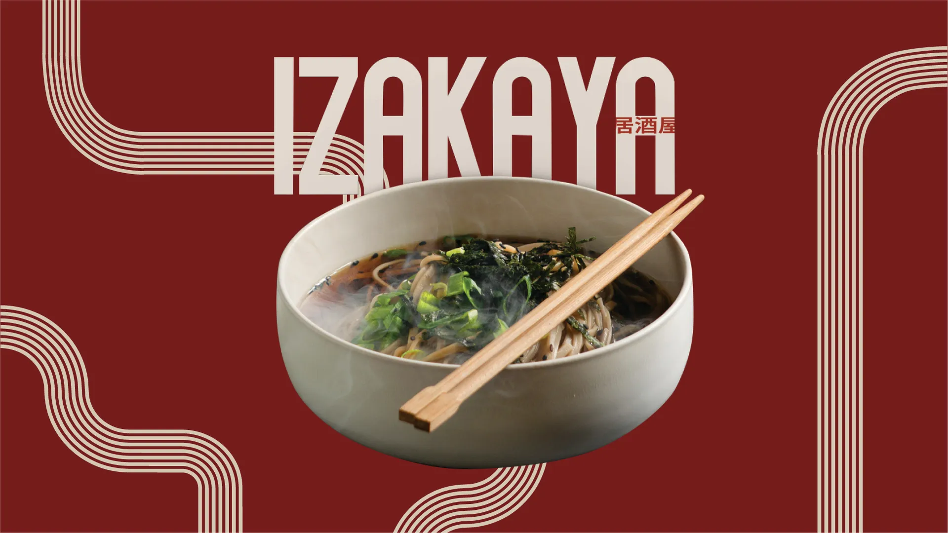
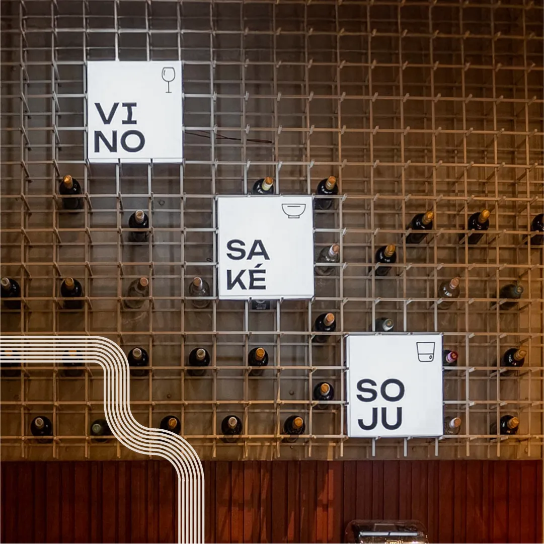
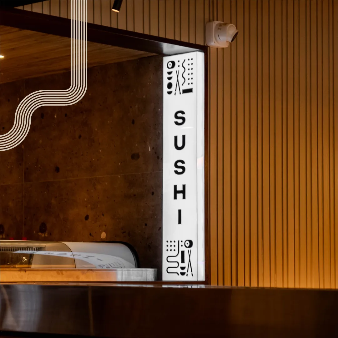
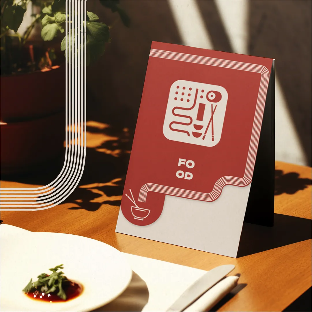
Illustrations & Patterns
The branding is layered with custom illustrations and patterns that tie back to IZA’s identity. These visuals flow through the space, appearing across menus, packaging, and wall art, creating a signature look that’s immersive without being overpowering.

Menus & Brand Applications
Designed to complement the space, IZA’s menus are sleek and structured, allowing for easy navigation while maintaining a strong visual presence. The beverage and sushi menus take on a more compact format, adding variety while keeping the design language cohesive. Across signage, uniforms, and packaging, the branding is intentional—bold where it needs to be and understated where it counts.
Impact
IZA’s identity was built to move with its audience—casual and inviting by day, electric and high-energy by night. It’s a space designed to evolve, bringing people back for a different experience every time.
Selected applications of the brand system across touchpoints.

Working on something like this?
Tell us about the brand or business you're building. We reply within 24 hours.
Start a project